· marketing · 7 min read
Unbounce Case Studies: Learning from the Best & Worst Landing Pages
A practical, example-driven guide to what makes Unbounce landing pages win-or flop. Learn the patterns behind top-performing pages and the common mistakes that tank conversions, with actionable tests you can run on Unbounce this week.
Outcome: Read this and you’ll be able to audit any Unbounce landing page, copy the patterns that win, avoid the mistakes that fail, and run focused A/B tests that move the needle.
Why this matters. Because Unbounce is more than a page builder - it’s a testing and traffic-matching platform. Get your page structure, messaging and experiment design right, and you’ll see conversion lifts quickly. Get them wrong, and you’ll leak traffic, credibility, and revenue.
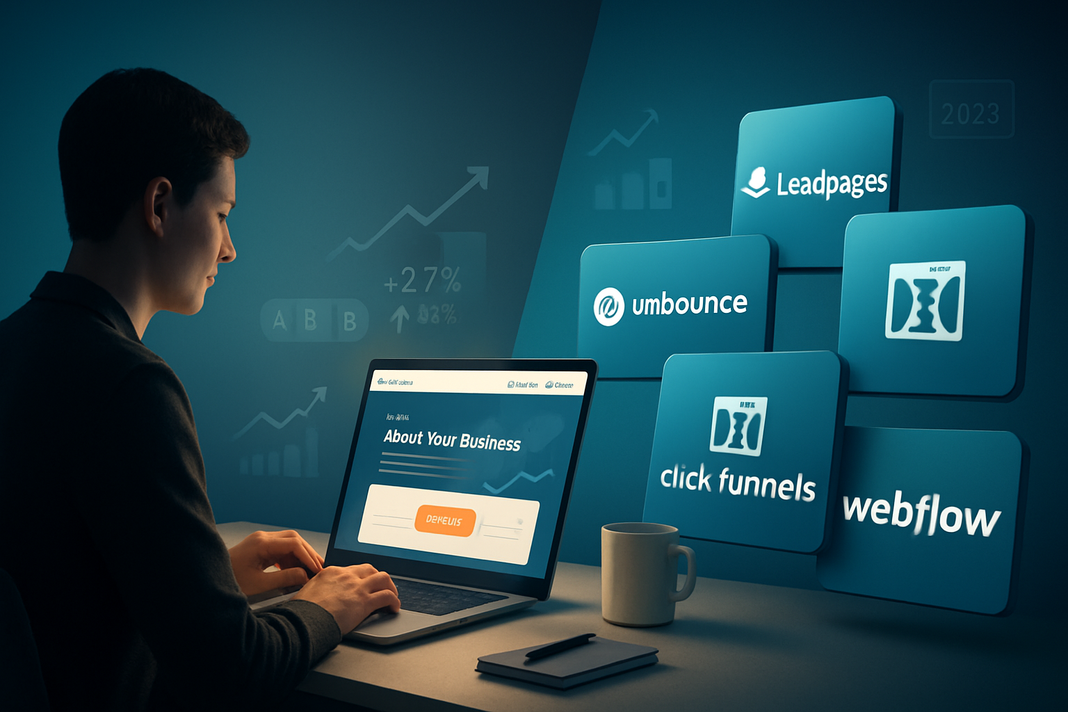
Quick orientation: what Unbounce gives you (so you can take advantage)
- Fast publishing and iterative edits.
- A/B testing plus Smart Traffic (traffic routing based on past performance).
- Dynamic Text Replacement to match ad copy and increase relevance.
- Clean integrations with analytics, CRMs, and form handlers.
Use these capabilities intentionally. Match the page to the ad. Use Smart Traffic to speed learning. And measure the metric that actually matters: qualified leads or revenue, not just form submits.
(If you want documentation from Unbounce on their features, their case study index and product pages are good reference points: https://unbounce.com/case-studies/ and https://unbounce.com/features/.)
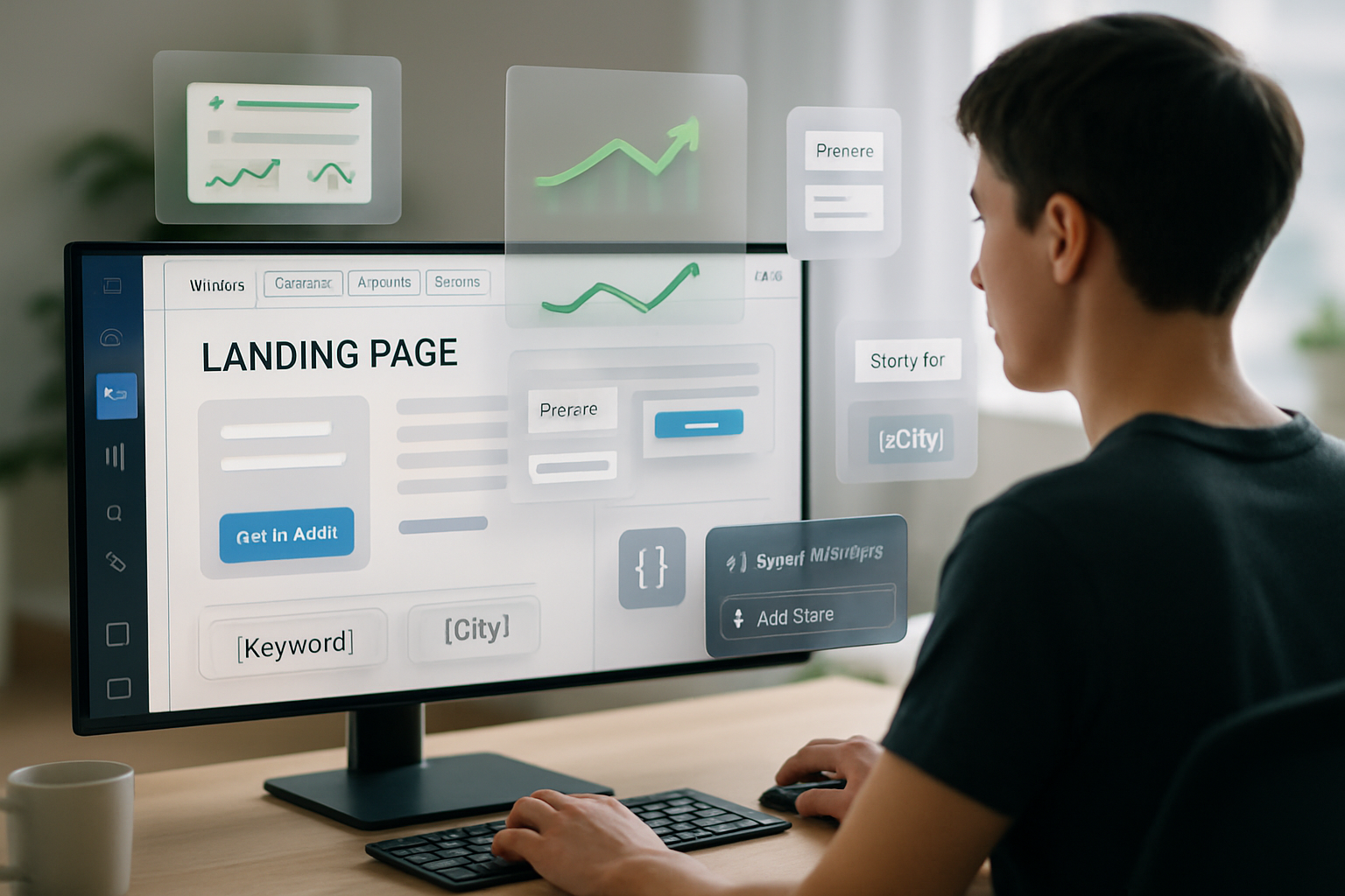
How I read a landing page: a fast audit framework
When I open a landing page I scan for five things - quickly. Use this same checklist to review pages on Unbounce:
- Headline clarity - Is the main value proposition unmistakable within 3 seconds?
- Message match - Does the headline and hero copy match the ad or search term that brought the visitor?
- Visual hierarchy - Single focal point and one primary CTA (not multiple competing CTAs).
- Trust & proof - Evidence (logos, testimonials, stats) that reduces anxiety fast.
- Friction - Form length, unnecessary links, slow loading or unclear next steps.
If a page fails 2 or more items, it likely needs a redesign or a focused A/B test.
Real-world wins: three example patterns from Unbounce case studies (what they did, why it worked, how to replicate)
Note: Unbounce publishes dozens of case studies. Below are distilled, repeatable patterns drawn from high-performing pages across their case study library and best-practice examples on the web.
Success #1 - The Single-Goal SaaS trial page
What it looked like
- Headline - one sentence promise about time-to-value (“Get your first report in 5 minutes”).
- Subheadline - short explanation of the benefit and a social proof line (company logos / count).
- A short 3-field form for trial signup or a single CTA to start a trial, with an image or short explainer video.
Why it worked
- Radical clarity. Visitors immediately know what they get and how fast.
- Low friction. Short form reduces abandonment.
- Message match. Ad copy promised quick setup; the landing page delivered on that promise.
How to replicate on Unbounce
- Use Dynamic Text Replacement (DTR) to echo search/ad keywords in the headline.
- Keep the form ≤ 3 fields on paid traffic; longer forms only after qualification.
- Use Smart Traffic to learn which variant visitors prefer.
Success #2 - The Product-Use Case Landing Page
What it looked like
- Focus on a single persona and use case (e.g., “Landing pages for HR teams”).
- Bullet list of targeted benefits and process steps.
- Strong customer quote from a recognizable brand.
Why it worked
- Relevance. Visitors self-segmentation when they see their specific use case.
- Reduced cognitive load. The page answers the immediate question - “Is this for me?”
How to replicate on Unbounce
- Create multiple niche pages (one persona per page) rather than one universal page.
- Use URL paths or DTR to route ads to the exact persona page.
- Run A/B tests that vary the persona headline and the hero image.
Success #3 - The Offer-Focused E-commerce / Lead Gen Hybrid
What it looked like
- Hard-offer in the hero (“Get 20% off your first order, plus free shipping”).
- Scarcity/urgency cues (countdown or limited quantity) and a short form or one-click flow.
- Clear product visuals and trust signals.
Why it worked
- Strong, immediate incentive overcame initial hesitation.
- Scarcity increased urgency, improving conversion velocity.
How to replicate on Unbounce
- Integrate the promo codes and inventory signals in the page design.
- Test urgency cues vs. no-urgency - sometimes clarity alone beats faux scarcity.
- Measure post-conversion outcomes (refunds, churn) to ensure quality.
Sources that back these approaches: research on landing page relevance and form optimization from CXL, HubSpot, and Unbounce’s own case study gallery (https://unbounce.com/case-studies/).
Real-world flops: common failed landing-page archetypes on Unbounce (and how to fix them)
Below are recurring mistakes pulled from audits across many Unbounce pages. These are the same failure modes you see in poorly performing case studies.
Failure pattern A - The ‘Everything and the Kitchen Sink’ page
Symptoms
- Multiple CTAs - “Buy”, “Learn More”, “Book Demo”, “Subscribe” all on the same page.
- Heavy content - long paragraphs, dense features lists.
- Distracting navigation links that take visitors away.
Why it fails
- Choice paralysis. Multiple next steps dilute the desired action.
- Cognitive overload. Visitors bounce before deciding.
Fix
- Reduce to one primary CTA. Relegate other actions to footer or secondary path.
- Use progressive disclosure for details (accordion, tabs, or secondary pages).
Failure pattern B - The Mismatched Message
Symptoms
- Ad said “Free audit”; landing page talks about enterprise pricing.
- Headline is vague or company-centric (“Welcome to Acme”) instead of customer-centric.
Why it fails
- Visitors feel tricked. Message mismatch kills credibility and raises bounce rates.
Fix
- Use Dynamic Text Replacement and exact ad-copy match.
- Keep the headline benefit-focused and specific.
Failure pattern C - The Over-Optimized for Designers, Not Humans
Symptoms
- Beautiful but confusing hero imagery.
- Overuse of micro-animations or heavy scripts that slow load time.
Why it fails
- Visuals that obscure the value proposition hurt comprehension.
- Slow-loading assets increase abandonment, especially on mobile.
Fix
- Replace hero art with product-in-context shots or simple explainer visuals.
- Compress images, defer non-critical scripts, and test mobile load times.
For UX evidence behind these fixes, see Nielsen Norman Group’s guidance on landing page clarity and visual hierarchy: https://www.nngroup.com/articles/landing-page-guidelines/.
A practical audit: 10-minute review you can run on any Unbounce page
- Open the page on mobile and desktop. Time to first meaningful paint? (Goal - < 3 seconds)
- Read the headline out loud. Is the outcome clear in one sentence?
- Count actions - how many CTAs? (1 = good; 3+ = bad)
- Scan for social proof above the fold.
- Check the form - number of fields and whether they’re necessary.
- Look for message match between the ad/UTM and the headline.
- Inspect load-blocking assets (videos, external fonts).
- Check analytics setup and conversion tracking.
- Find at least one testable hypothesis (e.g., shorten the headline, reduce fields, add a testimonial).
- Prioritize tests by expected impact and ease (ICE - Impact x Confidence / Effort).
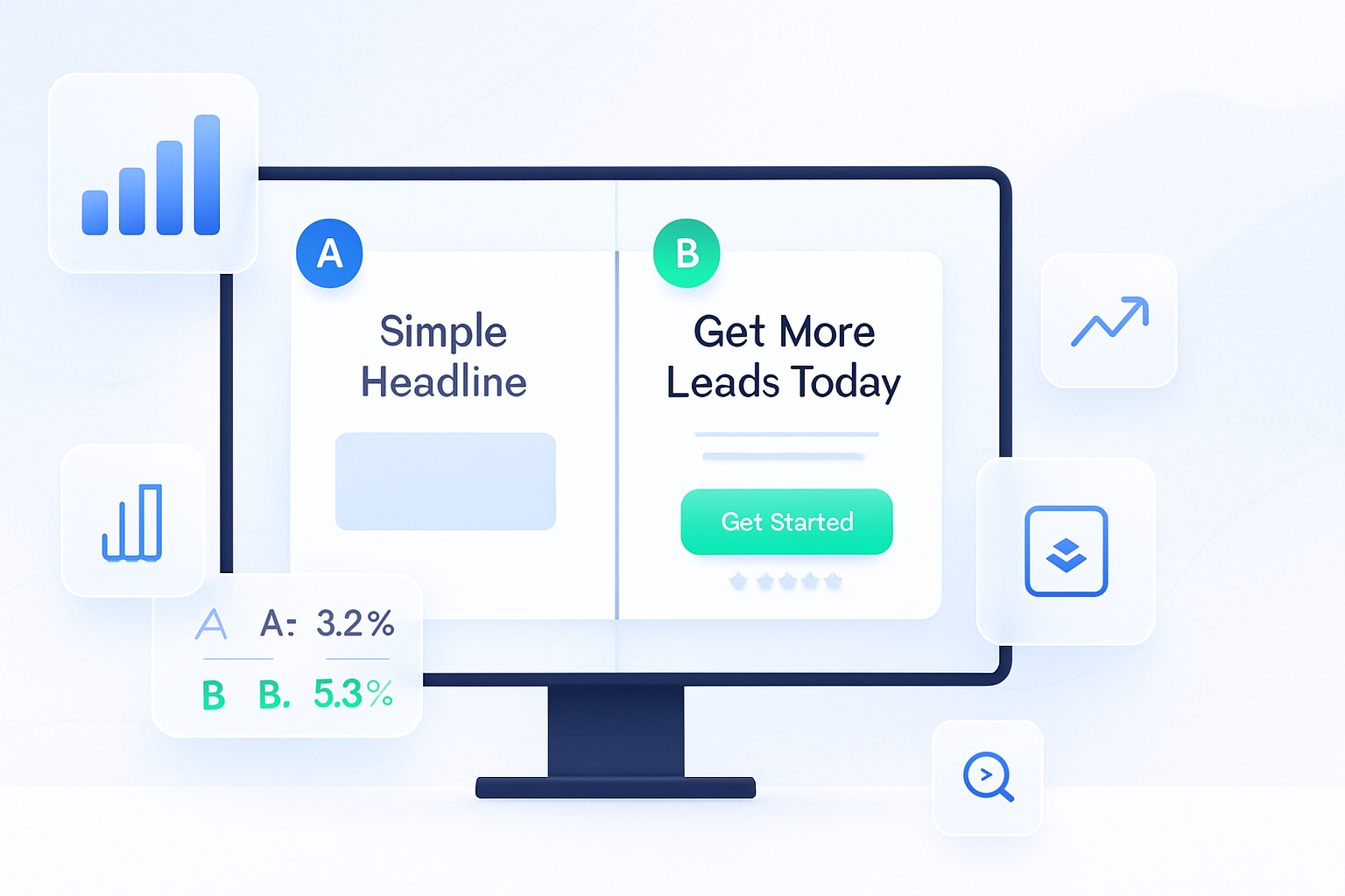
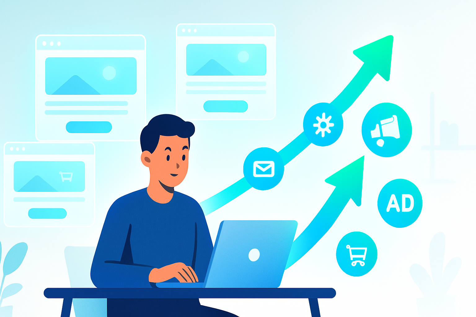
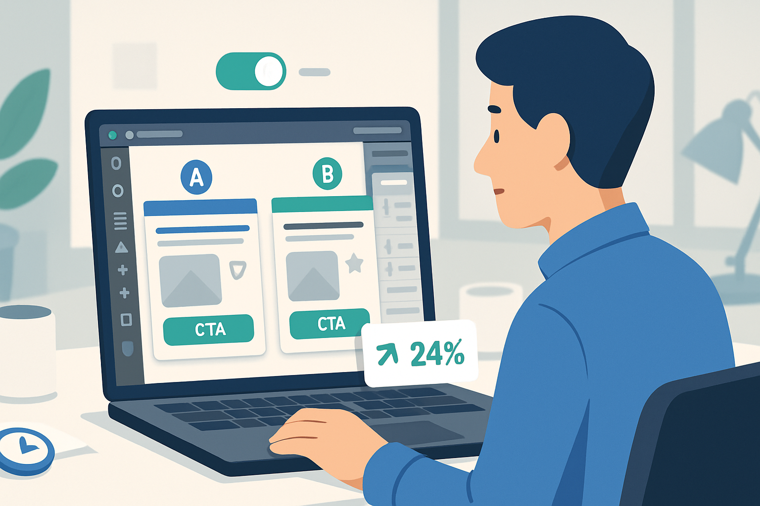
Seven A/B tests to run on Unbounce next week (high ROI, low effort)
- Headline clarity test - current vs. clear benefit-first headline.
- CTA prominence - color/size/placement test of the primary CTA.
- Form reduction - full form vs. a 2-field micro-form.
- Social proof placement - hero vs. below-the-fold.
- Image swap - product-in-use photo vs. abstract illustration.
- Price anchoring - show a crossed-out price vs. no anchor.
- Smart Traffic vs. uniform traffic - let Unbounce route visitors and compare performance.
Run one major change at a time for clear learnings. If you must run multiple changes, use multivariate design or interpret results conservatively.
How to interpret results properly (don’t celebrate the wrong metric)
- Primary metric = business outcome (e.g., trial-to-paid conversion, qualified leads). Secondary metrics = click-through, form completion.
- Watch post-conversion quality. A high conversion rate with poor lead quality is a false win.
- Use significance AND practical significance. Small lifts that cost a lot of traffic or time might not be worth the switch.
For advanced statistical guidance, CXL’s resources on A/B testing and statistical significance are helpful: https://cxl.com/blog/ab-testing-statistics/.
Example post-mortem (compact): a failing Unbounce page turned profitable
Situation
- Paid search traffic => landing page with a vague headline and a 6-field form. CTR was healthy, but conversions were poor.
Intervention
- Revised headline to a single benefit statement.
- Reduced form to email + one qualification field.
- Added a customer quote above the fold.
- Launched two variants and enabled Smart Traffic.
Result
- Conversions rose within two weeks. Post-conversion lead quality stayed stable. Team proceeded to test onboarding emails next.
This story is representative - not a verbatim case - but mirrors many successful optimizations seen across Unbounce case studies.
Checklist: launch-ready Unbounce page
- Headline communicates the single value prop in 3 seconds.
- Ad-to-page message match verified (DTR used if needed).
- One primary CTA and minimized navigation.
- Form is no longer than required (consider two-step flows).
- Social proof or trust indicators above the fold.
- Page loads < 3s on mobile (compress images, defer scripts).
- Analytics and conversion tracking in place.
- One prioritized hypothesis and A/B test set up.
Final takeaways - the single lesson to remember
Make the page about the visitor, not your product. Be specific. Remove noise. Test deliberately.
Clarity + relevance + low friction = predictable wins. When you combine that with Unbounce’s traffic-routing and testing tools, you get speed: faster learning, faster improvements, and faster lift.
References
- Unbounce case studies and product features: https://unbounce.com/case-studies/ and https://unbounce.com/features/
- Nielsen Norman Group on landing-page clarity and UX: https://www.nngroup.com/articles/landing-page-guidelines/
- CXL resources on landing page optimization and A/B testing: https://cxl.com/blog/landing-page-optimization/ and https://cxl.com/blog/ab-testing-statistics/
- HubSpot landing page examples and best practices: https://blog.hubspot.com/marketing/landing-page-examples