· creativity · 6 min read
How to Use VistaCreate for Stunning Social Media Campaigns
Step-by-step strategies to design eye-catching social media graphics in VistaCreate - from choosing the right sizes to storytelling, template mastery, and exporting for performance.
Imagine publishing a social post that stops thumbs, wins saves, and drives clicks. You’ll get there. This guide walks you, step-by-step, through using VistaCreate to design scroll-stopping social campaigns: the right sizes, visual storytelling techniques, template mastery, and practical export tips so your content looks brilliant everywhere.
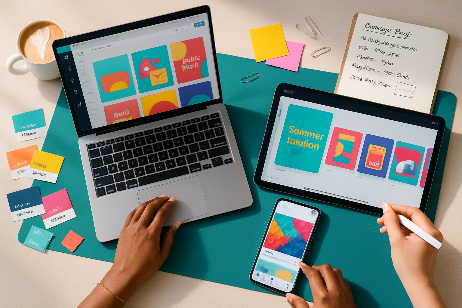
Why VistaCreate for social campaigns
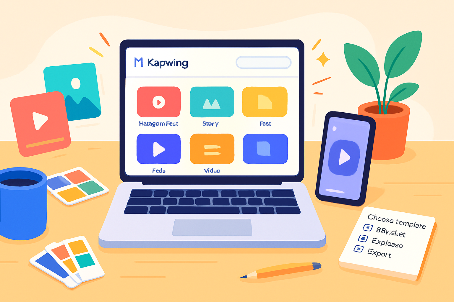
VistaCreate (formerly Crello) gives you an accessible design playground: pre-built templates, an intuitive editor, an easy resize tool, built-in animation options, and a brand kit to keep assets consistent. It’s fast. It scales. And it lets non-designers create professional results with predictable effort.
Learn more at VistaCreate’s site: https://create.vista.com/.
Outcome-first plan (What you’ll produce)
- One attention-grabbing feed post.
- A matching story or Reel thumbnail.
- A three-slide carousel that tells a short story and includes a CTA.
- Exported files optimized for each platform.
Follow the steps below and you’ll have all four in under an hour.
Step 1 - Start with a clear campaign brief (5 minutes)
If visuals are the engine, the brief is your map. Keep it tiny and specific: objective, single target audience, primary message, CTA, and required deliverables. Example:
- Objective - Drive email signups for a free guide.
- Audience - Marketing managers, 25–40.
- Message - Free 7-step content planning template.
- CTA - Download the guide now.
- Deliverables - Instagram feed post (1080×1080), Story (1080×1920), LinkedIn post (1200×627), 3-slide Instagram carousel (1080×1080 each).
A focused brief saves time and keeps templates and text consistent.
Step 2 - Pick the right template (10–15 minutes)
Templates are shortcuts, not prison cells. Use them to accelerate layout and hierarchy. In VistaCreate:
- Search by keyword (e.g., “Instagram business”, “carousel”, “story sale”).
- Filter by style, color, or industry.
- Choose based on structure, not exact imagery - select templates with a hierarchy that matches your brief (headline, subhead, CTA area).
When you pick a template, immediately swap brand colors and fonts. That reveals how much extra work the template needs.
Optimal sizes cheat-sheet (use these exact pixels)
- Instagram Feed - 1080 × 1080 (square) or 1080 × 1350 (vertical)
- Instagram Story / Reels Cover - 1080 × 1920
- Facebook Post - 1200 × 630
- Facebook Cover - 820 × 312
- Twitter / X Post - 1200 × 675
- LinkedIn Post - 1200 × 627
- Pinterest Pin - 1000 × 1500
- YouTube Thumbnail - 1280 × 720
For an updated master guide to social sizes see Hootsuite’s size guide: https://blog.hootsuite.com/social-media-image-sizes-guide/.
Pro tip: design at the listed focal size and use VistaCreate’s resize feature to generate platform-specific variations quickly.
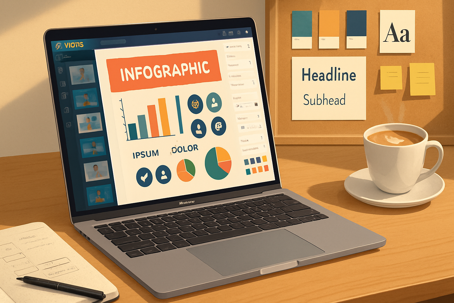
Step 3 - Visual storytelling: structure your message (10–20 minutes)
Good visual storytelling guides the eye in a clear narrative. Use these building blocks:
- Hook - a strong headline or visual that stops the scroll. Short. Bold. Specific.
- Context - a one-line subhead or short visual that explains the benefit.
- Evidence - a quick stat, short quote, or visual proof (badge, screenshot, testimonial).
- CTA - explicit, visible, and action-focused.
For carousels, treat each slide like a sentence in a short story: lead, explain, prove, and ask.
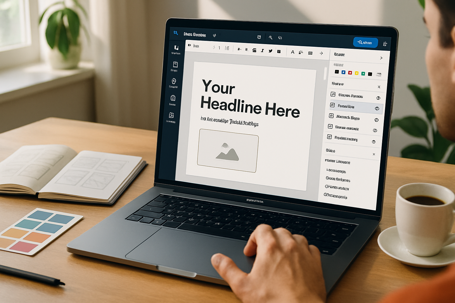
Step 4 - Layout, hierarchy and typography (10 minutes)
- Limit fonts to 1–2 families.
- Use size and weight for hierarchy - big headline, medium subhead, small body.
- Keep 16–24px equivalents for body text on social images to stay legible on phones.
- Give breathing room - maintain consistent padding from edges (at least 40–60 px when designing at 1080×1080).
Contrast is king. If your background is busy, add a subtle overlay or box to protect text.
Step 5 - Color and imagery that reinforce your brand (10 minutes)
- Use a primary color for headlines and CTA accents.
- Use 1–2 supporting colors for emphasis.
- Neutral backgrounds (muted gradients, soft textures) make text pop.
- Prefer real photos when communicating people, emotion, or use-cases. Use illustrations when you need abstraction or a brand-forward aesthetic.
In VistaCreate you can replace colors globally with a brand kit. Upload your logo and set color swatches to speed consistent changes.
Step 6 - Customize templates the right way (15 minutes)
- Replace placeholder text with your short copy.
- Swap images using VistaCreate’s stock library or upload your own.
- Use the grid and align tools to ensure consistent spacing.
- Group elements and name them for easy reuse.
- If a template element doesn’t fit, remove it. Simplicity beats forced decoration.
Quick accessibility tip: ensure sufficient contrast (aim for a 4.5:1 contrast ratio for body text). You can eyeball it or test with a contrast-checker tool.
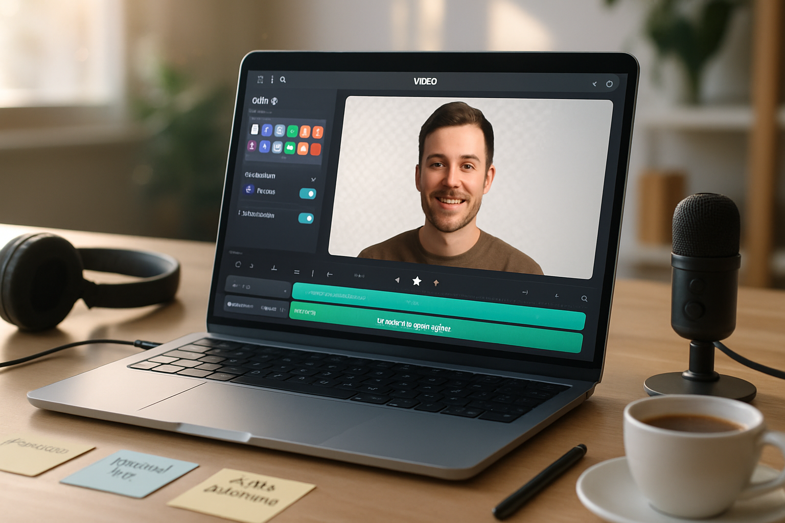
Step 7 - Add motion and interaction (when it matters)
Animated posts get more attention. VistaCreate supports simple animations and animated templates:
- Use subtle entrance animations for headlines.
- Animate only the element you want the eye to follow (e.g., CTA pulse).
- Keep animation duration short (1.5–3 seconds).
Export animated posts as MP4 or GIF depending on platform. MP4 is preferred for modern social networks.
Step 8 - Export settings & optimization (5 minutes)
- Use PNG for static posts with transparency or sharp graphics.
- Use JPEG for photo-heavy images to keep file sizes smaller (quality 70–85).
- Use MP4 for animated posts (H.264).
- Double-check pixel dimensions and bleed-safe zones before exporting.
Confirm final files on a phone to catch any small-legibility issues.
Step 9 - Production workflows & batch creation
- Duplicate master templates and swap imagery and copy to create variations.
- Use VistaCreate’s folders to organize by campaign and platform.
- Create a folder for final exports and name files with platform and date (e.g., ig-feed_2025-05-01.png).
Batching similar posts saves hours and keeps your visual language consistent.
Step 10 - Test, analyze, iterate
Design is hypothesis-driven. Launch multiple creatives, test small changes, and watch metrics:
- CTR and link clicks for performance.
- Saves and shares for value and virality.
- Post impressions and reach for creative resonance.
Use results to refine color, copy, or CTA placement. Repeat what works. Kill what doesn’t.
Example workflow: Instagram carousel (practical)
- Create a new design at 1080×1080.
- Pick a 3-slide carousel template with a consistent header area.
- Slide 1 - Hook image + one-line headline.
- Slide 2 - 3 short benefits in icons or bullets.
- Slide 3 - Screenshot or proof + CTA button.
- Export slides as numbered PNGs and upload to Instagram as a carousel.
Small detail. Big payoff.
Accessibility & brand safety reminders
- Add alt text where platforms allow.
- Avoid color-only cues; combine color with icons or labels.
- Always double-check claims and use licensed images.
Quick checklist before publishing
- Message matches brief.
- Correct sizes exported.
- Fonts legible on mobile.
- CTA clear and visible.
- File formats optimized for platform.
- Animations tested on mobile.
Helpful resources
- VistaCreate: https://create.vista.com/
- Social image sizes (reference guide): https://blog.hootsuite.com/social-media-image-sizes-guide/
Final thought
Use templates to speed the process, but design with intent. Templates give structure; your strategy gives them meaning. When pace and clarity align, your social campaigns stop the scroll and start the conversation. Design for clarity. Design for action. Design to be remembered.