· creativity · 6 min read
The Ultimate VistaCreate Cheat Sheet: Design Tips from the Pros
Master VistaCreate with pro workflows, composition rules, typography pairings, animation best practices, export settings, and time-saving tricks. This guide gives actionable steps and real-world recipes so you can produce polished designs faster - no matter your skill level.
Introduction - What you’ll get out of this guide
Hit the ground running. In the next 10–15 minutes you’ll learn the exact workflows and micro-habits experienced designers use in VistaCreate to produce cleaner, faster, and more consistent visuals. You’ll leave with practical recipes for social posts, presentations and short video ads - plus a one-page cheat sheet to reference while you design.
Start here and your projects will look sharper, land with clearer hierarchy, and require far less rework. That’s the outcome.
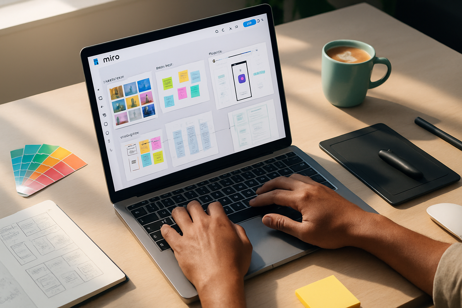
1) Quick orientation: VistaCreate fundamentals every pro expects you to know
- Templates are not final designs. Use them as structure and inspiration, then adapt.
- Set up a Brand Kit (logos, colors, fonts) at the start of a project so every canvas is consistent.
- Work in the native canvas size for the final platform. Use the Resize feature only after your layout is stable.
- Use Layers and Grouping to manage complexity. Name groups if your design has many elements.
Resources: VistaCreate’s help center is useful when you need feature specifics: https://create.vista.com/help/
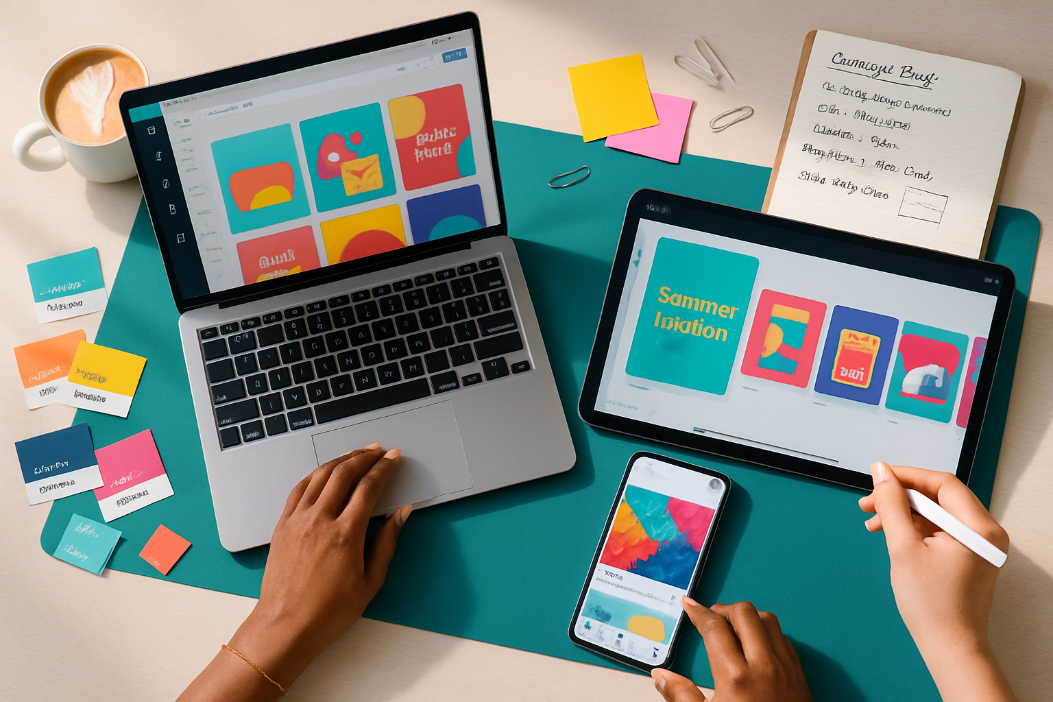
2) Workflow & asset management: design like a studio
- Start with constraints
- Pick one objective (promote, inform, convert). Design decisions should serve that objective.
- Build a mini brand kit per project
- 2 brand colors + 1 accent color.
- Primary headline font, secondary body font.
- One logo variation and one watermark.
- Create reusable templates
- Make 3 core templates - hero/social, information slide, CTA card. Duplicate and tweak instead of starting from scratch.
- Organize assets into folders
- Keep images, vectors, and exported files separated. Name versions with dates or v1/v2.
Why this matters: Designers constrain decisions to reduce noise. The faster you repeat good structure, the faster you iterate.
3) Composition & layout: rules to follow (not forget)
- Use a grid or columns. They fix alignment problems before you see them.
- Respect margins. Give elements breathing room.
- Establish a clear focal point. Large, high-contrast elements attract the eye.
- Follow a visual hierarchy - size > weight > color > position.
- Use alignment and repetition to create rhythm and cohesion.
Quick pro trick: block out your composition in grayscale first. If it reads properly without color, the structure is solid.
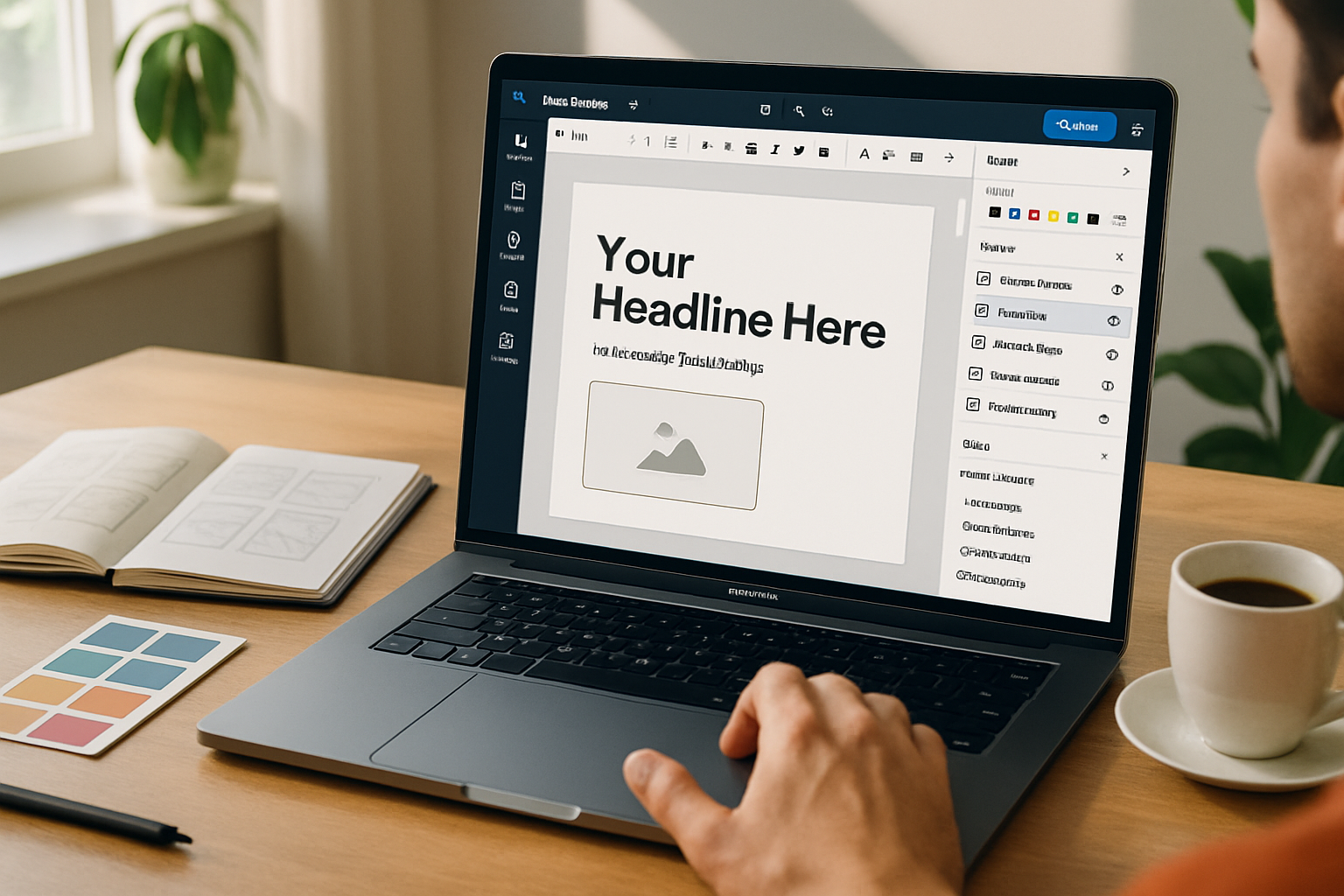
4) Typography: pair, scale, and direct attention
- Limit fonts to two families - one for headings, one for body. Exception: small brands may use one.
- Scale deliberately. Headline > subhead > body > fine print. Use consistent scale steps (e.g., 32/20/16/12 or 48/32/18/14).
- Contrast is key. Headlines should jump; body text should be comfortably readable.
- Kerning and line-height matter. Increase line-height for long copy; tighten for compact captions.
- Pairing tip - a geometric sans + humanist serif or a geometric sans + neutral sans often works.
Accessibility check: always validate color contrast for text against background using a contrast checker like WebAIM: https://webaim.org/resources/contrastchecker/
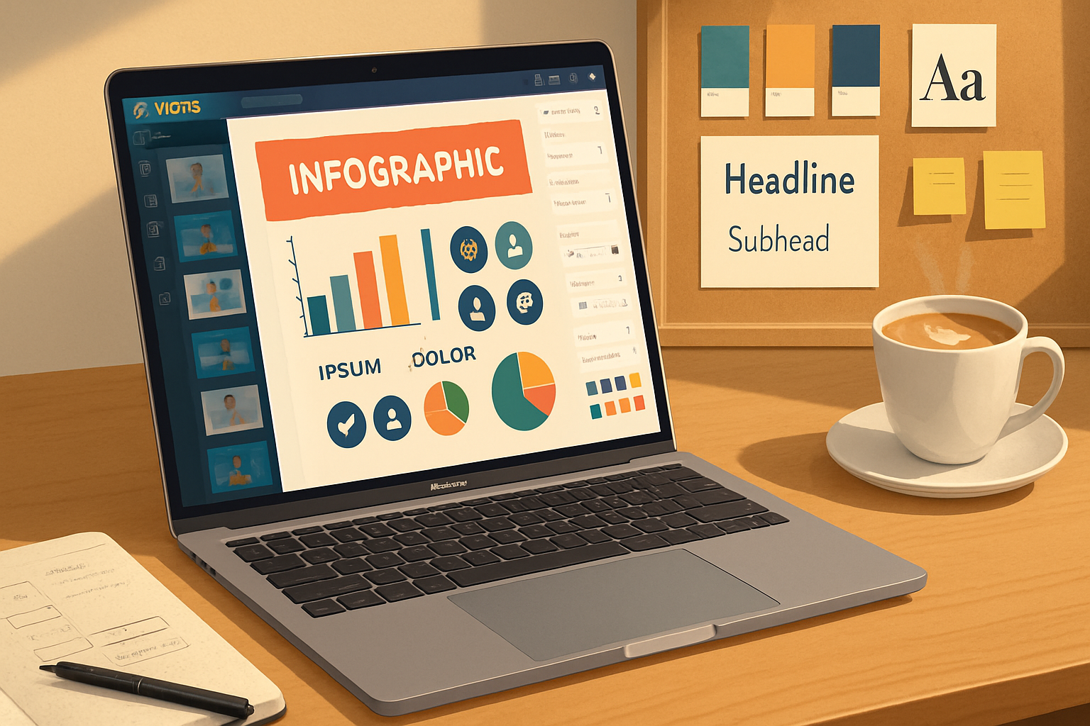
5) Color & imagery: choose with intent
- Decide on a dominant color and one or two accents. Too many colors = diluted message.
- Use color to guide action. Reserve the highest-contrast color for buttons/CTAs.
- Photographic imagery should have a visual center - crop to emphasize it.
- Remove busy backgrounds behind text by using subtle overlays, shapes, or the background remover.
Pro photo treatment: apply a single color overlay (5–25% opacity) to unify palette and improve text legibility.
6) Using VistaCreate’s advanced features (and when to use them)
- Background remover - great for product shots and portraits. Use manual cleanup if edge artifacts appear.
- Animation presets - apply subtle movement to increase engagement. Keep duration short (0.6–1.5s) and avoid competing motions.
- Masking and frames - place photos into shapes for clean crops and consistent composition.
- Import vectors and SVGs for crisp scaling - especially for logos and icons.
- Pages feature - design multi-slide presentations or carousels in one project for consistent flow.
Timing rule: animate only one or two elements per scene. Too many moving parts dilute the message.
7) Export, formats, and optimization
- PNG for crisp graphics with transparency. Use PNG-24 for complex images with gradients.
- JPG for photos where small file size is important. Export at 80–90% quality for a good balance.
- PDF for print or high-fidelity share. Check bleed and trim marks if you’re sending to a printer.
- MP4/GIF for short animations; prefer MP4 for quality and smaller size.
Pro export checklist:
- Check pixel dimensions match platform specs.
- Verify color mode for print (CMYK) vs. screen (RGB) if applicable.
- Run a quick proof on a phone. If something looks off on the device people will use, fix it.
8) Recipes: step-by-step designs you can copy right now
A. Social post that converts (Instagram/Facebook)
- Canvas - 1080×1080. Use a grid (3×3).
- Place hero image in a frame; apply 10–20% color overlay with your brand accent.
- Add headline in top-left (large, bold). Subhead below (smaller).
- Use CTA button at bottom-right with the accent color (high contrast).
- Export PNG and preview on mobile.
B. Presentation slide (clean and scannable)
- Canvas - 1920×1080. Use a 12-column grid or a 2/3 split.
- Left 2/3 - main message and imagery. Right 1/3: supporting bullets.
- Use consistent icon style and 1–2 colors for emphasis.
- Keep slides light on text; aim for one idea per slide.
C. Short video ad (6–15s)
- Canvas - 1080×1080 or 1920×1080 depending on placement.
- 0–2s - Hook - strong image and headline.
- 2–8s - Benefit or demo, animated callouts with subtle motion.
- Last 1–2s - CTA with button and website or handle.
- Export MP4, test on target platform.
9) Collaboration & handoff
- Use comments and notes if your team needs feedback.
- Export editable formats (PDF with links or source project) so others can iterate.
- Provide a short style guide for fonts, sizes, and colors when handing off designs.
Collaboration tip: when sharing a project, include an annotated slide that lists the exact colors and fonts used.
10) Time-saving pro tricks and micro-habits
- Duplicate instead of recreate. Make variations by duplicating the page and swapping images/text.
- Lock background elements to avoid accidental moves.
- Group and name similar elements (e.g., “CTA button - mobile”).
- Save frequently used combinations as templates.
- Keep a visual swipe file of layouts you like for quick inspiration.
Developer-level tip: export high-res assets and store them in a cloud folder. Link them into future projects to maintain consistency.
11) Common mistakes and how to avoid them
- Too many fonts. Limit yourself.
- Text too close to the edge. Use safe margins.
- Over-animating. If motion distracts, simplify.
- Low-contrast CTAs. Test on phones and in bright daylight.
Fix: always run a three-second test - show the design to someone for three seconds and see what they remember. If they miss your CTA, adjust.
12) Final checklist - the one-page cheat sheet
Before you export, run through this list:
- Objective clear? (single sentence)
- Brand kit applied (colors, fonts, logos)
- Grid and margins set
- Typographic scale consistent
- Readable contrast (text vs background)
- Single dominant visual focal point
- CTA stands out (size & color)
- Animations minimal and purposeful
- Correct canvas size & export format
- Proofed on target device
If you do these ten things every time, you’ll save revision cycles and deliver stronger, cleaner designs.
Closing note
Design is a craft of decisions. VistaCreate gives you the tools. The pro advantage comes from disciplined constraints, consistent templates, and small habits that scale. Start with the mini brand kit, save templates, and use the checklist above. Repeat. Your work will be faster, clearer, and more persuasive - every time.