· creativity · 6 min read
The Art of Visual Storytelling in FigJam: Tips for Impactful Presentations
Learn how to use FigJam's tools and visual design principles to craft presentations that are clear, engaging, and memorable - from planning the narrative arc to polishing the final export.

What you’ll achieve
Start a FigJam file and deliver a presentation that feels planned, collaborative, and easy to follow. You’ll craft a clear narrative arc, use FigJam’s visual toolkit to build hierarchy and clarity, and rehearse and present with confidence so your audience remembers your key insight.
Short outcome. Big impact.
Why visual storytelling matters in FigJam (quick)
Presentations succeed when they’re not just a stream of facts but a guided experience. FigJam is built for collaborative, visual thinking - which makes it an excellent canvas for storytelling: live reactions, simple visuals, and a flexible layout that supports iteration.
Use the tools to shape attention. Guide the conversation. Leave a memorable insight.
The narrative arc you should start with
Every effective presentation follows a simple arc. Use this as your blueprint before you design a single sticky note:
- Hook - Grab attention with a provocation, a surprising stat, or a short story.
- Context - Frame the problem or user need.
- Insight - Reveal the analysis, idea, or opportunity.
- Evidence - Show the data, prototypes, or examples that prove your point.
- Recommendation - What you want the audience to do next.
- Close - A short, memorable wrap-up and a call to action.
Map those beats to frames in FigJam. One concept per frame. One idea per visual.
Set up your FigJam canvas for storytelling
A sensible workspace makes designing fast and consistent.
- Create an overarching frame for each arc beat (Hook, Context, Insight, Evidence, CTA). Frames = slides.
- Add a left-side navigation strip (small frames or labels) so you can jump quickly during rehearsal.
- Use a simple grid or 8–12pt baseline spacing to align elements. Consistency reduces cognitive load.
- Establish a small component library on the side - title block, data card, quote card, icon set, and CTA button.
Tip: Duplicate your master frame to keep consistent layout when you iterate.
Visual language: build a small, consistent system
Design choices are decisions you don’t want to make on the fly during a presentation.
- Color - choose 2–3 functional colors - one for accents (calls to action), one for highlights (insights), and one neutral background. Use FigJam’s color styles or lock colors into components.
- Typography - use 1–2 font sizes for hierarchy (headline and body). Keep headlines short and punchy. FigJam follows Figma fonts; stick to legible system fonts if you expect cross-device viewing.
- Icons and imagery - pick one icon style (outline or filled). Use the same sticker pack or icon set across frames.
- Emphasis - use bold text, color blocks, or simple shapes to draw attention - not more than one emphasis method per frame.
Principle: Consistency = clarity.
Layout and hierarchy rules that make slides readable
These are small constraints that produce big improvements in comprehension.
- One thought per visual. If a frame has more than one conclusion, split it.
- Headline first. Place a short headline at the top of each frame that states the insight.
- Limit density. Aim for 3–5 visual elements per frame. If people need to read more than ~50 words, move details to a supporting frame or sidebar.
- Visual flow. Use connectors, arrows, or reading order (left-to-right, top-to-bottom) to guide the eye.
- White space is a feature. Give each element breathing room.
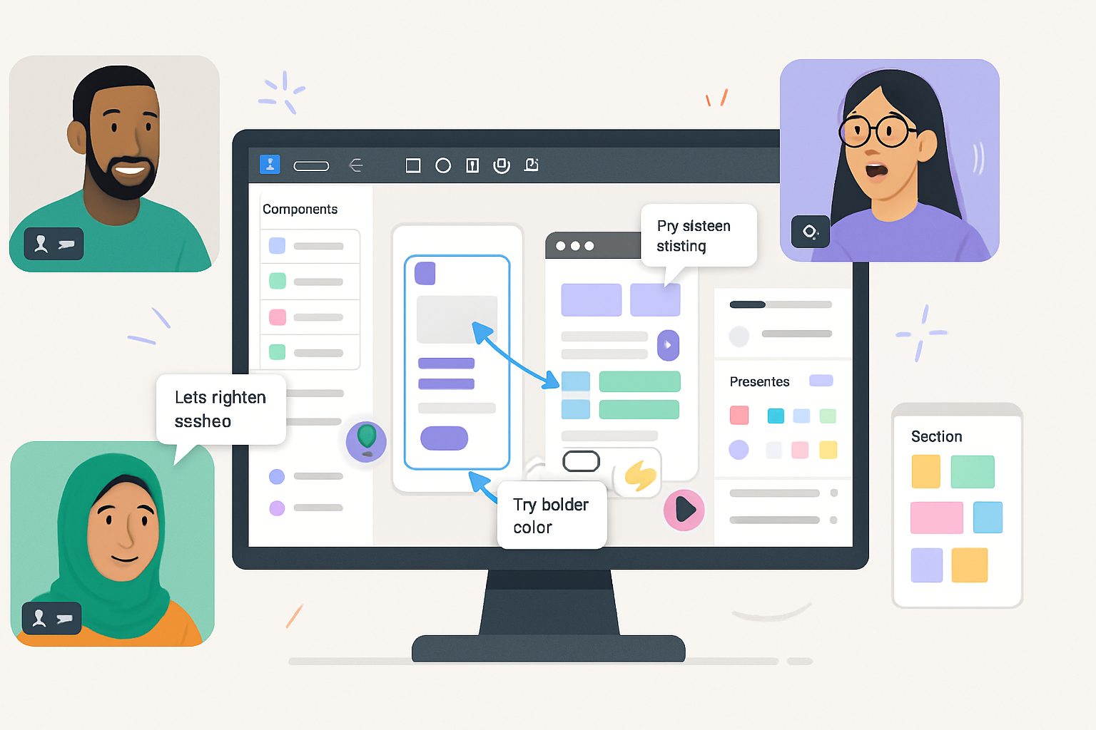
Use FigJam features to amplify storytelling
FigJam isn’t just a whiteboard - it has collaborative features you can use as part of the presentation.
- Frames & Present mode - Turn frames into slides. Present to focus the audience and hide editing controls.
- Sticky notes & Shapes - Use these for quick annotations, callouts, and to build lightweight storyboards.
- Connectors & Arrows - Make relationships explicit. Connectors are perfect for showing process, decision paths, or cause/effect.
- Widgets & Charts - Use chart widgets for quick, editable graphs. Embed or use community widgets for richer data visuals.
- Components & Stickers - Reuse UI elements and stickers for consistent visuals and faster iteration.
- Collaboration tools - timers, voting, and cursor chat help you run interactive segments or polls during a presentation.
- Emotes and Reactions - Invite quick feedback. Use reactions instead of verbal interruptions to keep flow.
Reference: review FigJam’s official docs to explore the latest widgets and features: https://help.figma.com/hc/en-us/articles/360053530554-Introduction-to-FigJam
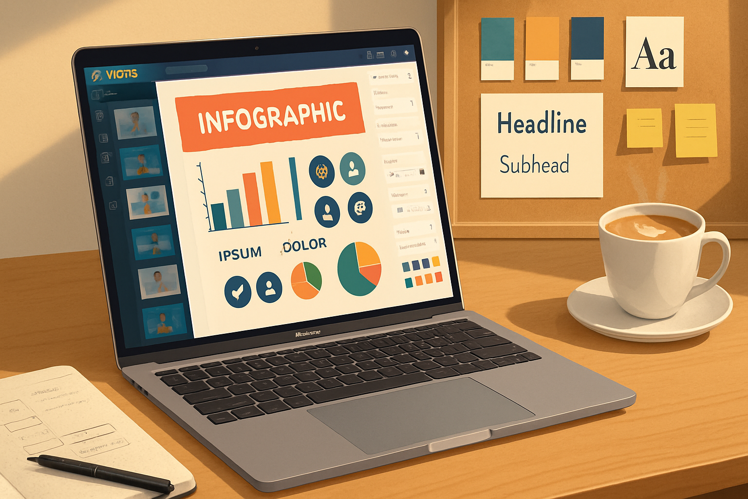
Designing data & charts for clarity
Data should prove the point - not distract from it.
- Pick the right chart. Bars for comparisons, lines for trends, stacked visuals only when proportions matter.
- Show the insight first. Put an annotated sentence above or beside the chart - “Sales rose 42% after X.”
- Remove chart junk. Gridlines, 3D effects, and excess ticks rarely add value.
- Highlight the relevant datapoint. Use color or a label to call out the key number.
- If the audience needs raw data, attach a hidden frame or sidebar they can open after the presentation.
For general best practices in visual design and hierarchy, see Nielsen Norman Group’s design principles: https://www.nngroup.com/articles/visual-design-principles/
Collaboration and rehearsal techniques
Make the presentation process collaborative and iterative.
- Run a dry run in FigJam with teammates using Present mode and the timer widget. Time each frame.
- Use cursor chat and voice/video (if available) to run through transitions and phrasing.
- Capture sticky-note feedback during the rehearsal and convert decisions into component updates.
- Run a 5-minute “audience check” at the end - invite three emotes to capture sentiment and one vote on the recommendation.
Rehearse transitions. The best visuals work with the spoken narrative - not instead of it.
Accessibility and legibility checks
Small accessibility improvements increase reach and clarity.
- Contrast - Ensure text and key shapes meet contrast needs. High contrast helps people with low vision and improves projector visibility.
- Type size - Headline ≥ 24px equivalent; body ≥ 16px when presenting at distance.
- Color independence - Don’t rely on color alone to communicate (use labels, icons, or shapes).
- Keyboard navigation - If others will navigate your FigJam, make the sequence of frames intuitive.
Exporting and sharing
You’ll likely share your FigJam after the session.
- Present & record - If you’re using a webcam/meeting tool, record the session for asynchronous viewers.
- Export frames as PNG or PDF for distribution. Use PDF if you want pagination preserved.
- Share a link with view/comment permissions and add a short TL;DR sticky note at the top for quick context.
A practical 10–15 minute workflow to build a 6-frame pitch in FigJam
- Create six frames and label them Hook / Problem / Insight / Evidence / Recommendation / CTA. (2 minutes)
- Drop a headline and 1–2 supporting bullets in each frame. Keep each headline as a declarative sentence. (3 minutes)
- Add one visual element per frame - chart, mock, quote, or screenshot. Use the Chart widget or copy a screenshot from Figma. (3 minutes)
- Apply color accents and place a CTA button on the final frame. (2 minutes)
- Run Present mode for timing and make two small edits. (3–5 minutes)
This minimal loop gets you from blank canvas to presentable story fast. Iterate from there.
Quick checklist before you hit Present
- One clear headline per frame
- 3–5 visual elements max per frame
- Color accents and type hierarchy established
- Key data highlighted and annotated
- Transitions practiced with timer
- Shareable link & TL;DR prepared
Final notes: design to invite action
Visual storytelling in FigJam is less about pretty slides and more about decisions. An effective FigJam presentation reduces friction - it makes it obvious what matters and what to do next. Use structure, consistent visuals, and FigJam’s collaborative tools to create presentations your audience can follow, react to, and act on.
Great visuals bring people into a story they can remember and act on. Make yours worth remembering.
References
- FigJam - Introduction to FigJam: https://help.figma.com/hc/en-us/articles/360053530554-Introduction-to-FigJam
- Visual design principles - Nielsen Norman Group: https://www.nngroup.com/articles/visual-design-principles/
- Edward Tufte - Visual Display of Quantitative Information: https://www.edwardtufte.com/tufte/books_vd