· creativity · 6 min read
Collaborative Design: Figma Tips for Remote Teams
Practical, in-depth strategies to harness Figma’s collaborative features-components, libraries, FigJam, branching, and plugins-for efficient remote team workflows and crisp handoffs.
Introduction - what you’ll achieve
Start faster. Reduce friction. Ship better designs with fewer review rounds.
By the end of this article you’ll be able to run synced and asynchronous design workflows in Figma that keep everyone aligned - designers, PMs, and engineers - while preserving a single source of truth for components, styles, and decisions.
Why Figma matters for remote teams
Figma was built for the web and real-time collaboration. That means multiple people can edit the same file at once, share context via comments and FigJam boards, and maintain live libraries that update across files. The result: fewer exports, fewer ambiguous screenshots, and less “Where did that change come from?”
Core collaborative features and how to use them
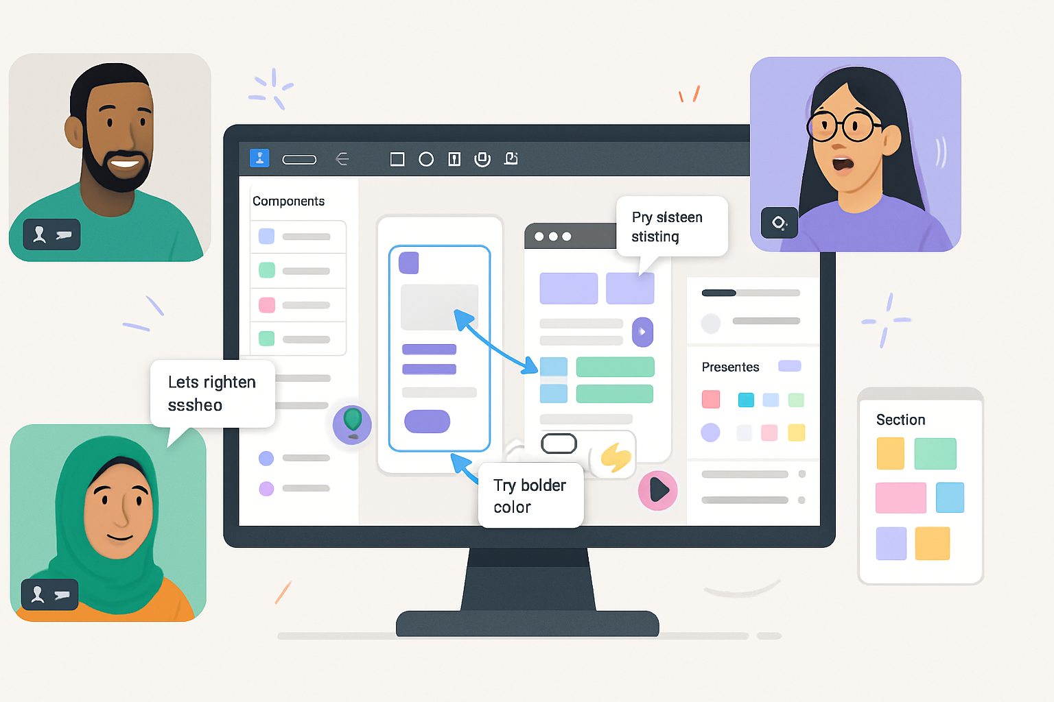
Multiplayer presence and follow mode
- What it does - see teammates’ cursors and follow them to observe work in real time. Great for pairing and quick design reviews.
- Tip - use follow mode during walkthroughs and switch control only when you want to edit.
Comments and threaded conversations
- What it does - attach comments to frames, components, or pixels. Resolve when done.
- Tip - always include an action or owner in the comment (e.g., @alex - update button hover state). Use comment filters to triage open issues.
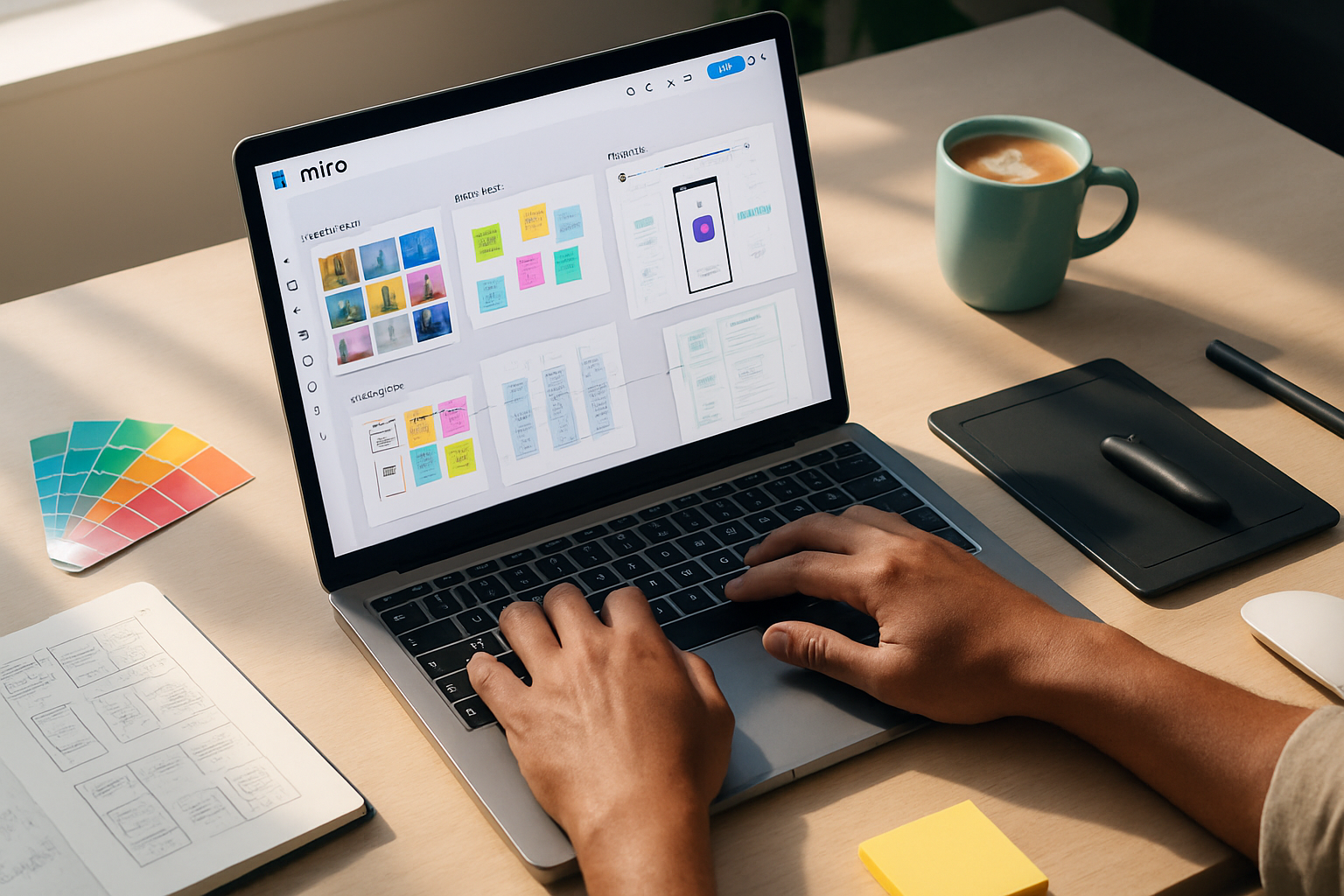
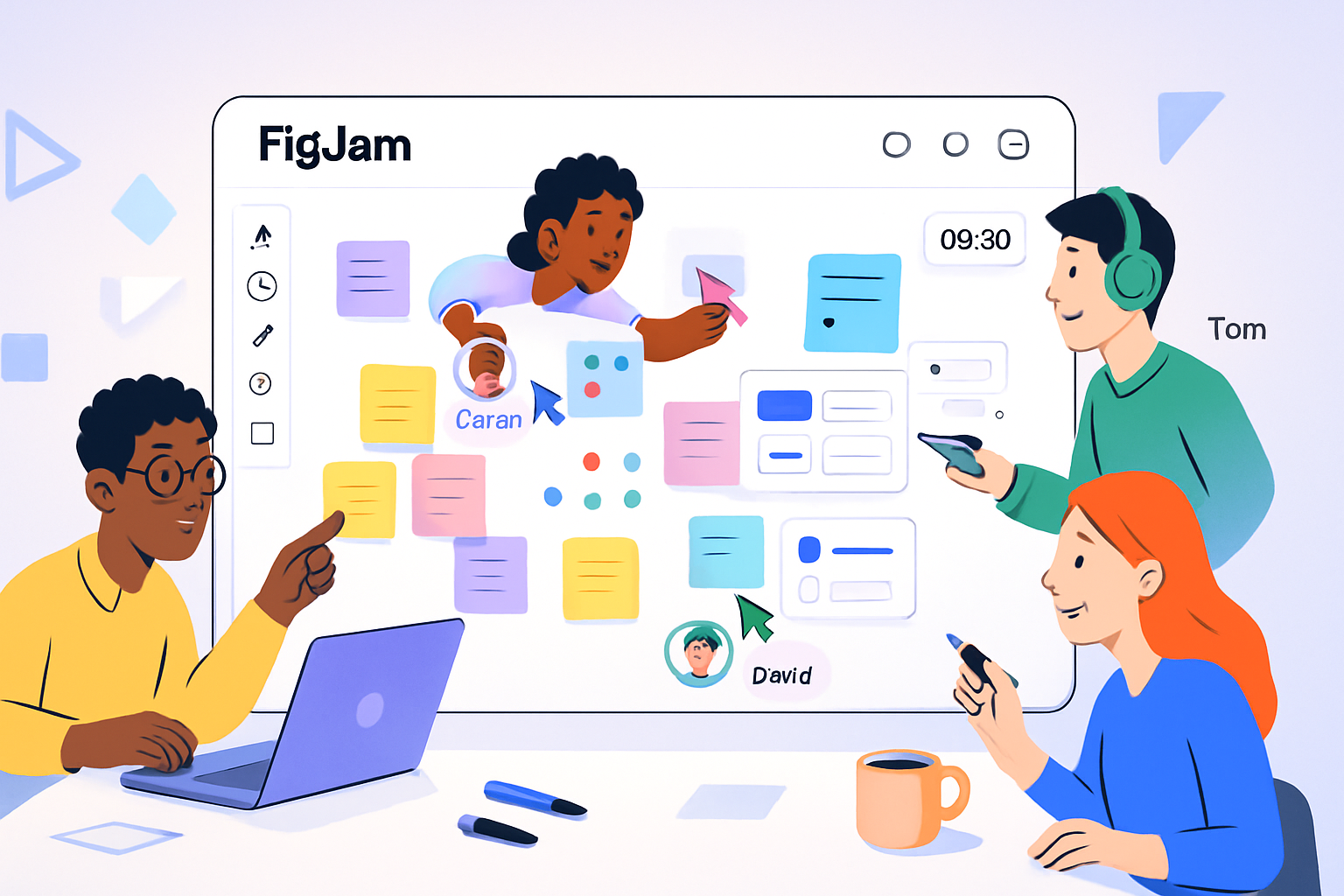
FigJam for whiteboarding and async workshops
- What it does - lightweight board for ideation, user journeys, and design critiques with sticky notes, timers, and templates. Learn more:
- Tip - start meetings in FigJam to capture decisions. Export the final board into the design file as a frame for reference.
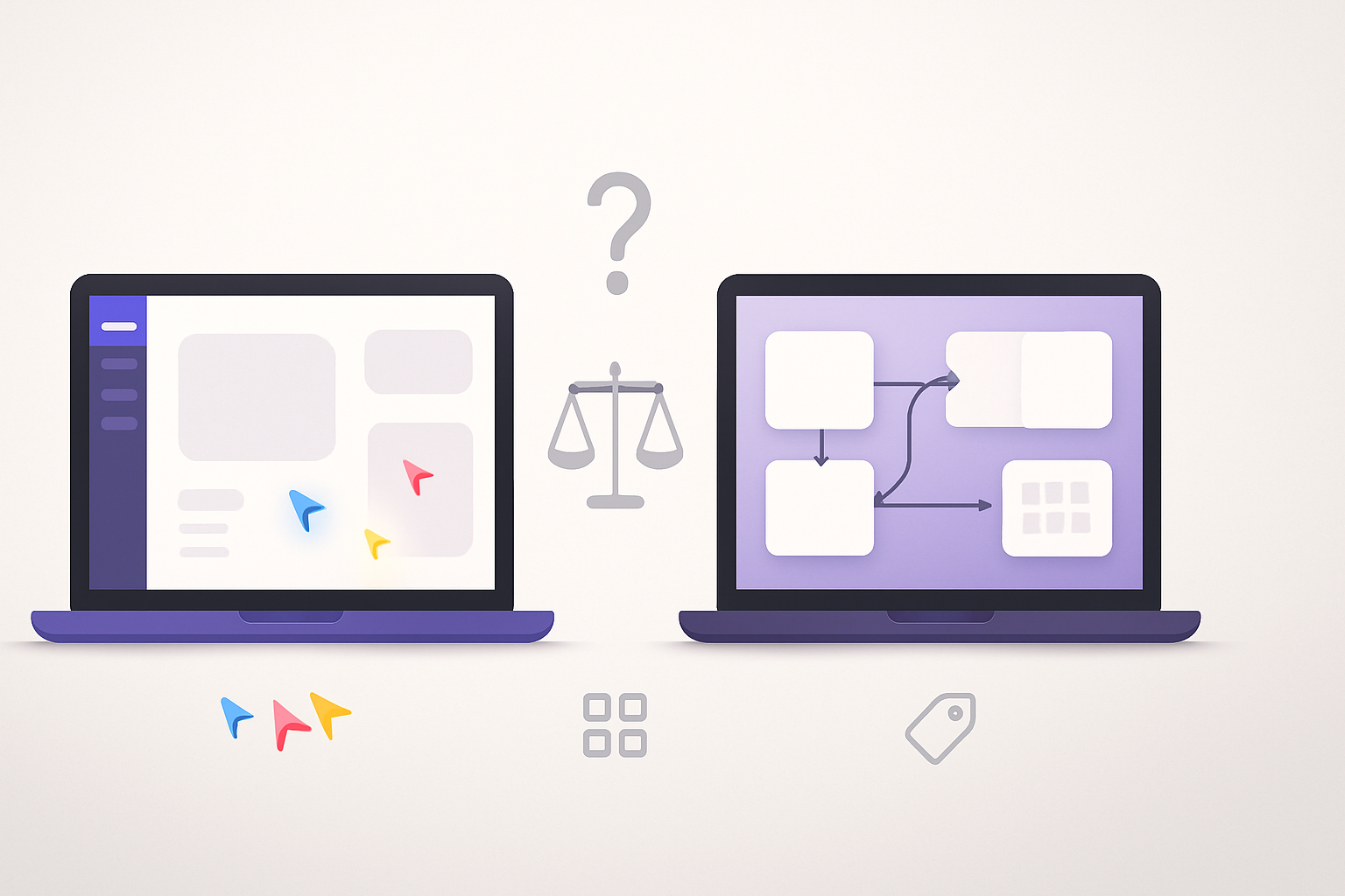
Components, variants, and Team Libraries
- What it does - create reusable UI building blocks and publish them across your team. Variants let you consolidate states (e.g., Button / Primary / Hover) under one component. Read more:
- Tip - give components stable, semantic names (Button/Primary/Default). Publish changes with a clear changelog message so consumers can accept or reject updates.
Styles (colors, typography, effects)
- What it does - centralize tokens for color, type, spacing. Updating a style propagates the change across files that use it.
- Tip - link style names to your design system tokens (e.g., color/brand/primary, type/h1/desktop) and document intended use in your library README.
Branching, version history, and merging
- What it does - create branches for big feature work, then merge after review. See:
- Tip - treat branches like Git feature branches: include a descriptive title, link the related ticket, and run a lightweight design review before merging.
Prototyping & interactive components
- What it does - build clickable prototypes, test flows, and create interactive states without code. Use Smart Animate and interactive components for richer demos.
- Tip - use prototypes for assumptions you want the team to validate in user tests - not for full polish unless necessary.
Plugins and automation
- What it does - extend Figma with plugins for tokens, content, accessibility checks, and more. Explore:
- Tip - add a curated list of team-approved plugins (e.g., Figma Tokens, Content Reel) and document when to use each.
Practical workflows and governance for remote teams
- File and page structure (a template)
- Root Workspace / Project
- File - Design System (Components, Styles, Tokens)
- File - [Feature]-Design (Frame-based flows + prototype)
- File - Designers’ Working File (early exploration)
- Within a file, use pages for lifecycle - 01-Research, 02-Exploration, 03-Delivery, 04-Archive
- Tip - keep the Design System file locked-down - only a few maintainers publish library changes.
- Naming conventions and layer hygiene
- Component naming - category/element/state (e.g., form/input/error)
- Frame/page ordering - prefix with two-digit numbers (01, 02) to preserve order
- Tip - consistent naming makes searching and replacing safe and predictable.
- Branch → Review → Merge flow
- Create branch from the main design file for any feature larger than a small tweak.
- Work in the branch, attach the related ticket, and link screenshots or prototypes back to the ticket.
- Request reviewers, include acceptance criteria, then merge after sign-off.
- Tip - use a checklist as part of the merge process: components updated, styles applied, accessibility checks done, prototype linked, developer handoff prepared.
- Component library governance
- Publish changes with an explicit changelog describing impact and migration steps.
- Maintain a deprecation policy - mark old components as deprecated but keep them available until migration is complete.
- Tip - schedule regular “library sync” reviews to prune unused components and keep docs current.
Async review and critique best practices
- Use a short template for feedback - What I see - Why it matters - Suggestion.
- Timebox async review windows (e.g., 48 hours) to keep momentum.
- Combine a short synchronous walkthrough (10–15 minutes) with asynchronous follow-up for detailed comments.
Handoff to engineering: make it painless
- Use Figma’s Inspect panel - ensure layers are named, constraints set, and export settings defined.
- Document edge cases and states in the prototype (empty states, error states, animations).
- Export tokens or use a tokens plugin to produce a machine-readable token set for engineers.
- Tip - add a “hand-off” page containing a checklist, links to components, and the final prototype.
Running remote collaborative design sessions (step-by-step)
- Pre-meeting
- Share objectives and artifacts (FigJam board or working file) 24–48 hours before the session.
- Invite only necessary stakeholders.
- During the session
- Start with a 2-minute outcome summary and success criteria.
- Use FigJam for ideation, then switch to the Figma file for concrete examples.
- Rotate who drives the cursor to keep engagement up; use follow mode for tours.
- Post-meeting
- Capture decisions in the FigJam board as actions with owners and deadlines.
- Link resolution and next steps to the related ticket.
Advanced techniques and tools
Design Tokens and automation
- Use the Figma Tokens plugin (community) to export tokens for code consumption and maintain parity across platforms.
Interactive components for living prototypes
- Build states into components and reuse them across flows so you can rapidly iterate on behavior without duplicating artboards.
Accessibility and performance checks
- Run color contrast checks via plugins and keep typography scale consistent. Track large files - break into linked files if performance degrades.
Etiquette and team norms
- Ownership - agree on who can publish changes to shared libraries.
- Comments - close and resolve threads. Avoid leaving “to do” items hidden in comments forever.
- Meeting norms - mute when not speaking, use reactions for quick signals, and keep critique focused on outcomes, not tastes.
Quick checklist before you merge a design branch
- Components used from Team Library where applicable
- Styles (color, type, effects) are applied consistently
- Prototype links work and show all states
- Accessibility checks completed (contrast, alt text where applicable)
- Handoff page includes tokens, export settings, and a changelog
- Reviewer approvals are recorded in the branch notes
Resources
- Figma Help Center - Collaborate in Figma: https://help.figma.com/hc/en-us/articles/360040451373-Collaborate-in-Figma
- FigJam overview: https://help.figma.com/hc/en-us/articles/360056054214-About-FigJam
- Components docs: https://help.figma.com/hc/en-us/articles/360040450393-Create-and-use-components
- Branches and merges: https://help.figma.com/hc/en-us/articles/360051510393-Explore-branches-and-merge-changes
- Figma Community (plugins & templates): https://www.figma.com/community
Final note - what this gives you
When your team uses Figma’s collaboration features intentionally - with structure, naming conventions, branch workflows, and clear ownership - remote work stops feeling fragmented. It becomes a continuous, visible conversation where decisions live with artifacts, and handoffs are predictable. The payoff is simple: fewer meetings, fewer misalignments, and design that ships with confidence.