· creativity · 7 min read
The Psychology of Color in Mural Design: How to Choose Wisely
Explore how different colors influence mood and behavior and get practical, research-backed guidance for choosing color palettes that connect with target audiences for commercial murals.
Introduction
Color is one of the most immediate and powerful tools a muralist has. A single wall painted with the right palette can energize a plaza, make a storefront memorable, or create a calming refuge in a busy urban corridor. But choosing colors at random gambles with how people will feel and behave in front of your work. Thoughtful color choices let you guide attention, reinforce brand values, respond to cultural context, and shape emotional responses.
This post summarizes the core psychological effects of common colors, explains contextual and cultural caveats, and offers a practical workflow and checklist so you can choose colors that truly resonate with your target audiences for commercial murals.
How color affects mood and behavior - the basics
Research shows that color can influence perception, emotion, and even behavior. The effect depends on hue (which color), saturation (intensity), and value (lightness/darkness). Two useful reviews that summarize this literature are Satyendra Singh’s work on color in marketing and broader reviews of color and psychological functioning (Singh, 2006; [Elliot & Maier, review overview referenced in practice]). For accessible summaries of how colors influence mood, see resources like Verywell Mind’s overview of color psychology and the Nielsen Norman Group on color and usability.
Here’s a practical summary of common associations (note: associations are probabilistic, not absolute):
- Red - Energy, urgency, passion. Useful for activation-draws attention, can increase heart rate. Use for calls to action or to emphasize movement. Excessive red can feel aggressive.
- Blue - Trust, calm, professionalism. Common in corporate and healthcare settings. Cooler blues calm but can feel distant if overused.
- Green - Balance, nature, growth. Connotes environmental, wellness, and freshness. Mid- to deep greens are grounding; bright greens are invigorating.
- Yellow - Warmth, optimism, caution. High-energy and attention-grabbing but can be fatiguing at high saturation.
- Orange - Friendly, playful, energetic. Works well for hospitality and retail contexts where approachability is desired.
- Purple - Luxury, creativity, spiritual. Deep purples feel sophisticated; lighter lavenders feel soothing.
- Pink - Soothing (soft), playful (hot pink). Cultural and generational factors strongly influence reactions.
- Black/White/Gray/Brown - Neutrals set tone and hierarchy. Black is bold and authoritative; white implies openness and cleanliness; grays are modern but can be dull; browns feel earthy and comforting.
For more nuance on how color affects perception and attention, see Nielsen Norman Group’s articles on color and usability NNGroup: Color in UX and the WebAIM guidance on contrast and accessibility (W3C Web Content Accessibility Guidelines).
Cultural and contextual considerations
Color meanings are not universal. Cultural background, age group, and local history change how colors are read:
- Red in China often connotes luck and celebration, whereas in parts of West Africa it may be associated with death or danger in some contexts.
- White is a color of purity in many Western contexts but can be associated with mourning in some East Asian cultures.
Always research local color symbolism, especially for permanent commercial work. Talk with community members and stakeholders before finalizing major color decisions.
Color and brand alignment for commercial murals
Commercial murals rarely exist in a vacuum: they support a brand, attract customers, or communicate a message. Use these steps to align mural color with brand strategy:
- Clarify the brand’s core emotional goals (e.g., trust, excitement, sophistication).
- Translate emotions into color attributes (cool vs. warm; saturated vs. muted).
- Integrate brand colors where appropriate, but don’t be a slave to exact brand swatches-murals often benefit from expanded palettes that complement brand colors rather than replicate them exactly.
- Consider the competition - use contrast in hue or saturation so the mural distinguishes the brand from neighboring businesses.
HBR-style marketing literature and studies of color in marketing show that color can increase brand recognition dramatically when used consistently and deliberately (Singh, 2006).
Practical tips for choosing colors that resonate with target audiences
Start with audience research
- Who will see the mural (commuters, shoppers, families, students)?
- What emotional state do you want to evoke? (energize, calm, invite, inspire)
- Are there demographic or cultural specifics to respect?
Audit the site and surroundings
- Lighting - Daylight, shade, or artificial lighting changes perceived color. Test colors on-site at different times.
- Adjacent colors - Nearby storefronts, street furniture, advertising, and greenery will affect how your mural reads.
- Viewing distance - Large-scale murals read better with bolder, simpler color zones; detailed low-contrast shifts disappear from far away.
Choose hue, saturation, and value intentionally
- Hue picks the emotional family (blue = calm, red = energetic).
- Saturation sets energy level; muted palettes read sophisticated; saturated palettes read playful or urgent.
- Value controls legibility and depth; use light/dark contrasts to create readable shapes.
Use color harmonies and contrast for balance
- Complementary colors (opposite on the color wheel) create vibrant contrast.
- Analogous colors (adjacent hues) create harmony and are safe for calming scenes.
- Triadic or split-complementary schemes can yield dynamic yet balanced palettes.
Prioritize accessibility and legibility
- Ensure sufficient contrast between foreground and background to make text and important visual elements readable from a distance. Use the WCAG contrast guidelines as minimums for readability (W3C WCAG).
- Consider color blindness - avoid encoding critical information using only red/green contrasts. Tools like Coblis and Chrome colorblindness simulators can help.
Test physically and digitally
- Create large-scale mockups or digital renderings using realistic lighting and texture maps.
- Paint small trial swatches on-site if possible and observe over a day and evening.
- Use digital tools to iterate quickly - Adobe Color (
Consider material and finish
- Matte paint reduces glare and softens saturated colors; glossy finishes intensify color and reflections.
- Weathering, pollution, and UV exposure fade pigment over time-choose high-quality exterior paints and varnishes.
Palette strategies and examples
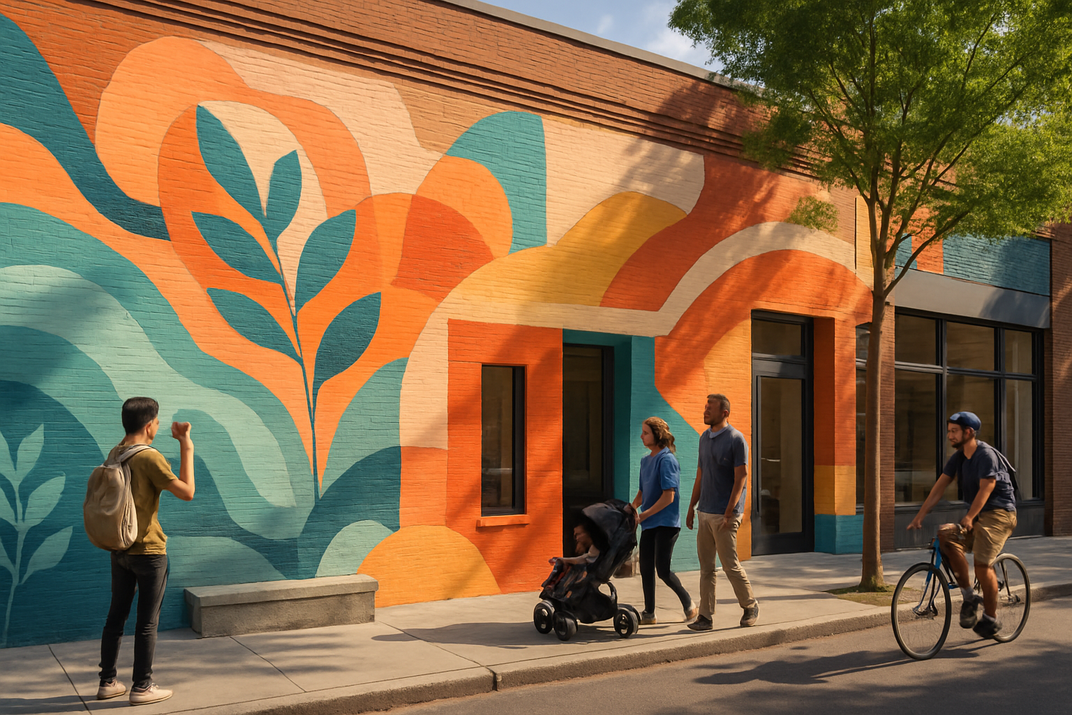
Urban retail (goal - attract shoppers): High-saturation accent colors (coral, teal) paired with neutral anchors (warm gray, off-white). Use bright focal points near entrances.
Hospitality/restaurant (goal - invite, relax): Warm mid-saturation palette-soft terracotta, muted olive, cream. Use saturated accents sparingly.
Healthcare/wellness (goal - calm, trust): Cool, desaturated palette-soft blues, sage, gentle lavenders. Keep contrasts moderate to relieve visual stress.
Tech/innovation (goal - modern, energetic): Deep navy anchors with bright accent colors (electric blue, lime, magenta) used as signaling elements.
When in doubt, create a primary color family for large shapes and a 1–3 color accent set for focal details and calls to action.
Quick workflow checklist for commercial murals
- Define audience and emotional goals.
- Audit site lighting, surrounding colors, and viewing distances.
- Map brand color requirements and decide how strictly to follow them.
- Pick base hues by emotional intent (calm = cool, energize = warm/saturated).
- Create a limited palette (3–6 colors) with clear roles - background, midtones, accents, and neutrals.
- Test mockups in situ and digitally; check accessibility and colorblind readability.
- Choose paint types and finishes that match intended look and durability.
- Get stakeholder feedback and iterate before final application.
Mini case example (hypothetical)
A café near a college campus wanted a mural to increase foot traffic. Audience: students (18–25), goal: feel energetic and approachable. Constraints: small sidewalk, heavy foot traffic, adjacent brick façades.
Solution highlights:
- Palette - Warm sunset gradient (muted coral to soft tangerine) with teal accents for contrast.
- Saturation - Mid-high for energy but slightly muted to avoid visual fatigue.
- Composition - Large, simple color fields readable from 30+ feet, small teal details near doors to guide the eye.
- Materials - UV-resistant exterior acrylic with matte finish to reduce glare.
Result: Increased social-media photos and measured uptick in stroll-in customers during peak hours (hypothetical outcome, but typical of similar projects).
Common pitfalls to avoid
- Ignoring local cultural color meanings.
- Using too many high-saturation colors, which creates visual noise.
- Failing to test under real-world lighting and at scale.
- Prioritizing personal preference over audience needs and brand goals.
Conclusion
Color in mural design is both an aesthetic and strategic choice. When chosen intentionally-based on audience psychology, cultural context, brand alignment, and site conditions-color can amplify a mural’s impact, drive behavior, and create memorable places. Use the tools and checklist above to move from guesswork to confident, evidence-informed palette decisions.
References and resources
- Verywell Mind - Color Psychology - How Colors Influence Our Moods and Behaviors:
- Nielsen Norman Group - Color in UX: https://www.nngroup.com/articles/color-usability/
- WebAIM - Contrast Checker and WCAG guidelines: https://www.w3.org/WAI/standards-guidelines/wcag/ and https://webaim.org/resources/contrastchecker/
- S. Singh - Impact of Color on Marketing (research overview): https://www.researchgate.net/publication/235312262_Impact_of_color_on_marketing
- Adobe Color: https://color.adobe.com
- Coolors color palette generator: https://coolors.co