· marketing · 7 min read
5 Controversial But Effective Landing Page Designs: Are You Brave Enough to Try These?
Five unconventional landing page patterns that break rules - and convert. Learn when each works, how to implement it, what to test, and the ethical/UX trade-offs so you can decide whether to be bold.

Outcome first: try one brave experiment and you could lift engagement, qualify better leads, and make your brand unforgettable. This post breaks down five controversial landing page designs - why they work, when they fail, and exactly how to test them without blowing your funnel.
Why break the rules?
Most landing pages look the same. Headline. Hero image. Features list. CTA. You get safe and predictable results. Sometimes predictable means forgettable. And sometimes small tweaks aren’t enough.
Beating noise often means doing the opposite of what everyone else is doing. Risky? Yes. Rewarding? Often yes - when you do it intentionally and test rigorously.
Below are five controversial but proven approaches, with practical anatomy, copy cues, testing ideas and the ethical or accessibility pitfalls to watch.
1) Brutalist / Anti-design: Make them stop scrolling
Why it’s controversial
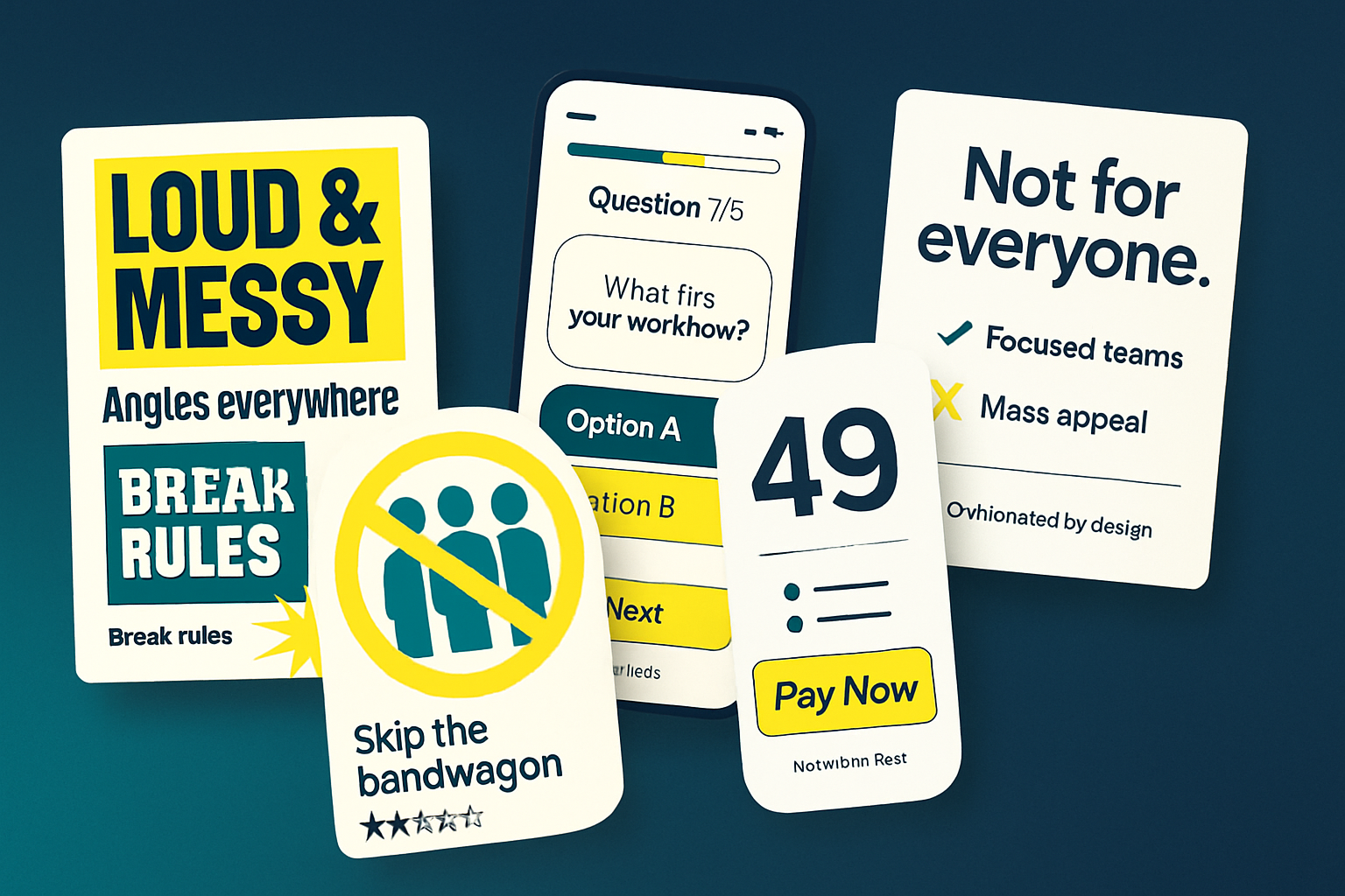
- It intentionally rejects polish. It looks raw, loud, and sometimes ugly. Many marketers are taught to remove friction - brutalist designs add friction on purpose.
Why it works
- It captures attention by breaking visual norms. In a sea of glossy templates, an “ugly” page signals authenticity and can increase time on page and curiosity-driven conversions.
When to try it
- When your audience is jaded or visually sophisticated (designers, creative buyers). When brand personality allows risk. When you need standout for a campaign.
Anatomy and copy cues
- High-contrast typography, imperfect alignment, purposefully clashing colors.
- Minimal imagery or hand-drawn graphics.
- Copy that leans on attitude - short, punchy, almost combative.
Example mini-wireframe (conceptual)
[Huge, raw headline]
[Short rebellious subhead]  [CTA: "Try it - if you dare"]
[Odd grid of rough product screenshots]
[Small trust signals: "Loved by 2,315 maniacs"]
Metrics to watch
- Bounce rate, time on page, conversion rate, scroll depth.
Pitfalls
- Can harm perceived credibility for conservative audiences.
- Accessibility and color contrast must still be respected even if the look is rough.
Further reading: Brutalist Websites - examples and inspiration: https://brutalistwebsites.com/
2) Quiz-first / Interactive gating: Convert by asking first
Why it’s controversial
- Classic landing pages present value before asking questions. Quiz-first pages interrupt that flow by asking visitors to answer questions before showing the offer.
Why it works
- Personalization and investment - answering questions creates micro-commitment and makes the final recommendation feel tailored.
- It qualifies visitors automatically and can increase lead quality dramatically.
When to try it
- Complex products or services where fit matters (software, financial products, B2B services).
- When you have multiple personas and need to route visitors to different experiences.
Anatomy and copy cues
- One question at a time. Conversational microcopy. Progress indicator.
- End-state delivers a personalized result plus CTA or gated lead form.
Example flow
- Question 1 - “What best describes your company size?”
- Question 2 - “Biggest growth challenge right now?”
- Result page - “Here’s the plan for X-sized teams. Book a demo.”
Metrics to watch
- Completion rate, conversion rate after result, quality of leads (MQLs/SQLs), NPS of the flow.
Pitfalls
- Too many questions kill completion. Keep it 3–7 micro-questions.
- Mobile UX must be frictionless - tap targets, one action per screen.
Further reading: how interactive content can increase conversions - CXL: https://cxl.com/blog/interactive-content-quizzes/
3) Negative social proof / Reverse scarcity: Tell them what others rejected
Why it’s controversial
- Most psychology-based tactics teach positive social proof - show how many people like you. Negative social proof highlights rejections or low ratings. It feels risky and can be ethically murky if used manipulatively.
Why it works
- It qualifies and disarms simultaneously. When you say “Not for everyone,” risk-averse or uninterested visitors self-select out, leaving a smaller, more committed audience.
When to try it
- High-touch, high-price offers where fit matters. Brands that want to attract evangelists rather than volume leads.
Anatomy and copy cues
- “Not for you if…” sections up-front.
- Transparent trade-offs - “We don’t integrate with X. We’re for Y.”
- Negative reviews framed constructively - show a 3-star review that explains a mismatch.
Example microcopy
- “This product is built for teams that like structure. If you prefer improvising, this won’t fit.”
Metrics to watch
- Lead quality, demo-to-close rate, churn/post-purchase returns.
Pitfalls
- Avoid deceptive framing. Negative social proof should be honest - don’t invent reasons to exclude people.
Further reading on social proof and persuasion: Nielsen Norman Group: https://www.nngroup.com/articles/social-proof/
4) Pricing-first / Paywall-first: Put price before persuasion
Why it’s controversial
- Traditional funnels delay price until after features and benefits. Pricing-first flips that - you show cost early or require payment/commitment immediately.
Why it works
- It immediately qualifies visitors and saves time for both sides. It weeds out bargain hunters and reduces wasted demos or trials.
When to try it
- Clear, commodity-like offers or when you want to attract serious buyers only (premium software, consultancy, limited-seat courses).
Anatomy and copy cues
- Clear pricing blocks above the fold.
- Benefit bullets that justify price in one glance.
- A CTA that emphasizes the commitment - “Start with a paid plan” or “Enroll now - limited seats.”
Example snippet (hero)
[$199 / month]  [Headline: "Everything you need to start"]
[3 bullets: ROI, support, integrations]
[CTA: "Get started - no trial"]
Metrics to watch
- Conversion rate, average order value, refund rate, LTV of early buyers.
Pitfalls
- Can dramatically lower top-of-funnel conversion if your audience expects free trials.
- Be transparent about refunds and guarantees to reduce buyer anxiety.
Further reading: pricing page best practices - HubSpot: https://blog.hubspot.com/marketing/pricing-page-examples
5) Radical honesty / “Not for everyone” pages: Use self-selection copy
Why it’s controversial
- Marketing usually paints the broadest possible net. Radical honesty is selective. It says - we’re not for you - and that’s deliberate.
Why it works
- People crave authenticity. Clear, honest positioning improves alignment and reduces wasted acquisition costs. It also builds brand loyalty among the right customers.
When to try it
- Brands with a strong point of view and high retention on fit.
- When initial acquisition costs are high and you want better-qualified leads.
Anatomy and copy cues
- “We’re not for you if…” placed near hero.
- Direct copy - “We’re expensive. We move fast. We don’t onboard for you.”
- Testimonials from customers who “fit” the profile.
Metrics to watch
- Lead quality, conversion-to-paid, churn, satisfaction of acquired customers.
Pitfalls
- If your differentiation is shallow, honesty can sound like laziness.
- Be careful not to alienate adjacent segments you might want later.
Further reading: persuasion and candid copy - Copyhackers: https://copyhackers.com/
How to experiment safely: a pragmatic testing playbook
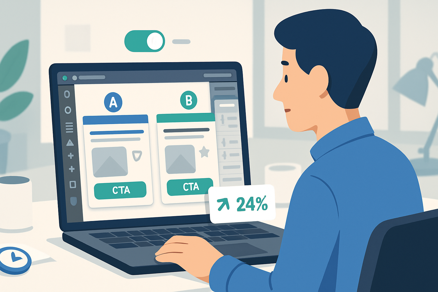
You can’t adopt controversial layouts blindly. Test them. Here’s a pragmatic A/B testing plan you can follow.
- Pick one hypothesis
- Example - “A quiz-first landing page will increase qualified leads (MQLs) by 20% vs. the control because it pre-qualifies visitors.”
- Define metrics
- Primary - MQL conversion rate.
- Secondary - quiz completion rate, demo requests, bounce rate, time on page.
- Segment and sample size
- Run the test on traffic channels where fit matters (organic, paid search for intent). Use a sample size calculator (Optimizely/VWO) to estimate required visitors based on baseline conversion.
- Build a minimal, production-ready variant
- Keep the experiment lean - one change, one page. Keep tracking in place.
- Run for full statistical power
- Avoid stopping early. Aim for at least the required sample size and consistent traffic patterns across weekdays.
- Analyze beyond the headline
- Look at downstream impact - lead quality, MQL-to-SQL conversion, LTV.
Simple event-tracking checklist
- Pageview
- CTA clicks (primary and secondary)
- Form submissions
- Quiz completion (if applicable)
- Revenue or demo scheduled events
Quick A/B test hypothesis example (text)
HYPOTHESIS: Replacing the hero with a none-glossy, brutalist hero will increase time on page by 25% and lift newsletter signups by 10% among creative audiences.
METRIC: time_on_page, signup_rate
SEGMENT: organic_social_traffic
DURATION: until sample_size reached (min 2 weeks)
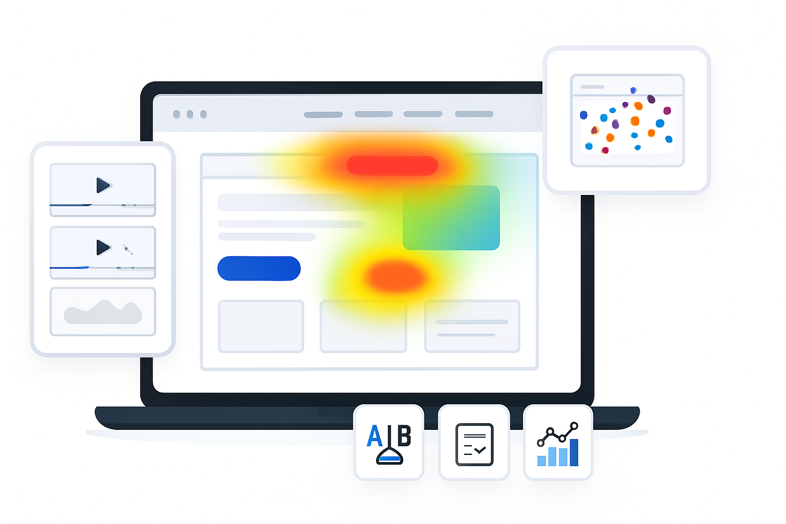
Tools to consider: Optimizely, VWO, Google Optimize (deprecated in 2023 - plan replacements accordingly), fullstory/Hotjar for qualitative insights.
Further reading on sample sizes and testing best practice: Optimizely optimization glossary: https://www.optimizely.com/optimization-glossary/sample-size-calculator/
Ethical, accessibility and brand risk checklist
- Be honest. Don’t fake scarcity or manipulate with false social proof.
- Respect accessibility - color contrast, keyboard navigation, readable fonts even if the look is “ugly”.
- Test on mobile first. Many controversial patterns fail on small screens.
- Track not just conversion but retention and refunds - short-term conversion spikes can hide long-term cost.
Quick practical examples you can copy (patterns)
- “Not for you” hero - Short headline + two-line explainer + three items that disqualify people.
- Quiz-first microflow - 3-step mobile-first question flow + personalized CTA.
- Pricing-upfront hero - Prices in large type, benefit bullets, single CTA.
Small code example (pricing-first hero HTML - skeleton)
<section class="pricing-hero">
  <h1>$199 / month</h1>
  <p>All features. Priority support. Cancel anytime.</p>
  <ul>
    <li>Trusted by teams that grow 30%+</li>
    <li>Onboarding in 24 hours</li>
  </ul>
  <a class="btn-primary" href="/signup">Start Paid Plan</a>
</section>
Final thoughts: be brave, but be rigorous
Controversial designs are not a blunt instrument. They are experiments. They work when paired with intention, testing, and respect for users.
Pick one pattern that aligns with your business goals and audience. Build it lean. Test it properly. Measure downstream impact - not just clicks.
Do the work, and you might find that the designs others call reckless are simply effective strategies waiting for a smart rollout.
References
- Brutalist Websites (examples): https://brutalistwebsites.com/
- Social proof and persuasive design - Nielsen Norman Group:
- Interactive content and quizzes - CXL:
- Pricing page best practices - HubSpot:
- Copy and conversion resources - Copyhackers:
- A/B testing sample sizes (Optimizely): https://www.optimizely.com/optimization-glossary/sample-size-calculator/


