· marketing · 6 min read
From Zero to Hero: How to Create a High-Converting Landing Page in Unbounce in Under 30 Minutes
A practical, time-boxed walkthrough that shows how to build a high-converting Unbounce landing page in 30 minutes or less - includes a minute-by-minute plan, copy templates, design rules, and tracking & testing steps.
Outcome first: in 30 minutes you’ll publish a focused, conversion-ready landing page in Unbounce that collects leads and starts producing data. No slow design debates. No paralysis-by-options. Ship fast. Learn faster.
What you’ll achieve in 30 minutes
- A live Unbounce landing page (hosted or on your domain).
- A clear headline, single conversion goal (form or CTA), and persuasive hero section.
- Basic tracking (pixel/analytics) and a test/A‑B variant or Smart Traffic enabled.
Ready? Set a timer. Let’s do this.
The 30-minute sprint (minute-by-minute)
- 0–5 minutes - Choose a template & set the conversion goal
- 5–12 minutes - Build the hero - headline, subheadline, image, CTA
- 12–18 minutes - Add and simplify the form; include trust signals
- 18–22 minutes - Mobile check and speed/UX polish
- 22–26 minutes - Add tracking, integrations, and Smart Traffic
- 26–30 minutes - Publish, smoke-test, and start an experiment
This structure forces decisions, reduces scope, and prioritizes what matters: conversion.
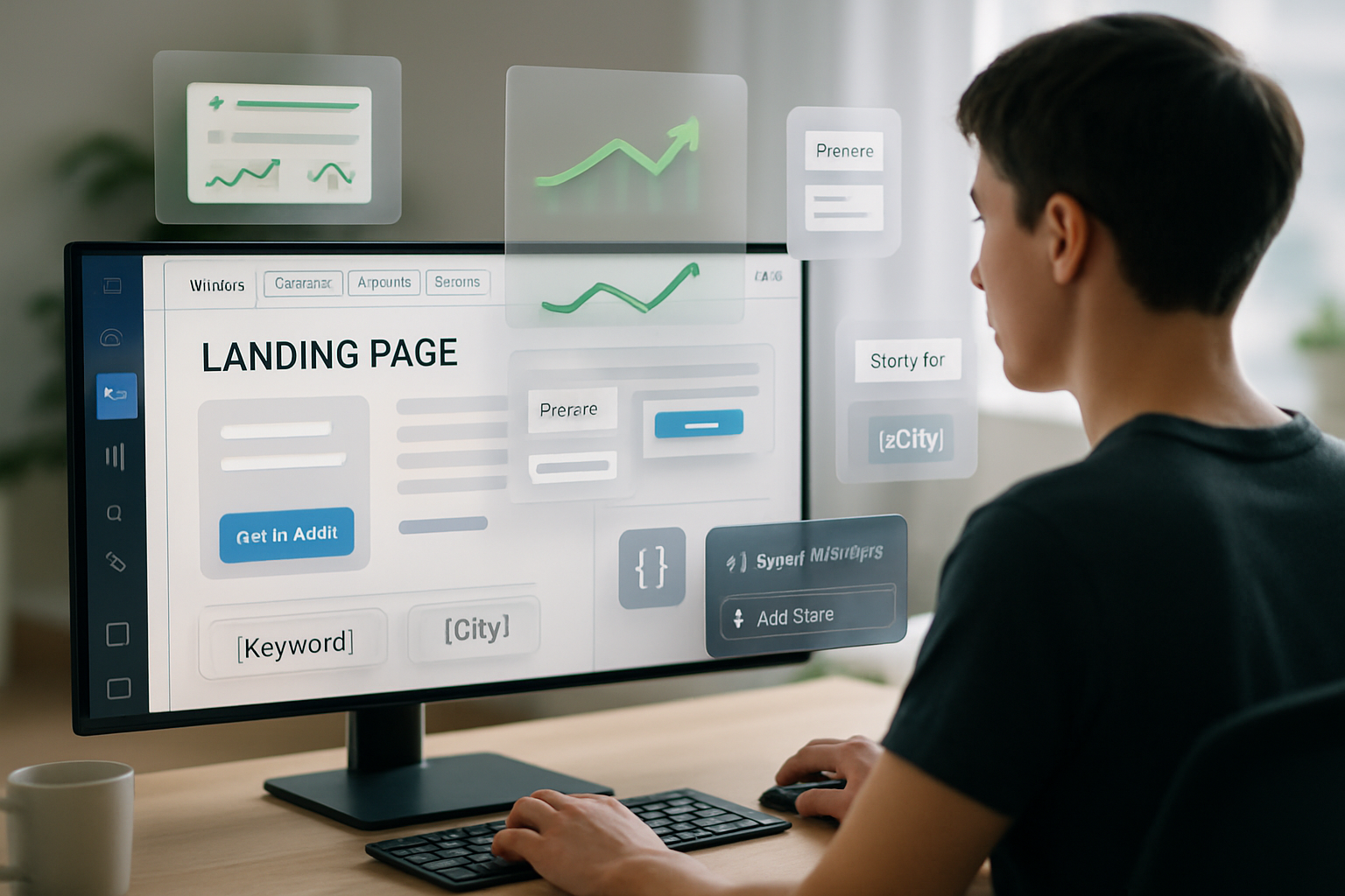
Step 1 - Choose the right starting point (0–5 minutes)
- Open Unbounce and create a new landing page using Smart Builder. Pick a template that matches your goal (lead gen, click‑through, product demo).
- Templates save huge time; choose one with a clear hero, single-column form or CTA, and trust blocks.
- Reference - Unbounce Smart Builder features:
- Define the conversion goal up-front - is it a form submit, a click-to-book, or a button click? This decides layout and copy.
Quick tip: if you only have a few minutes, prefer a single-column layout - it converts better because it reduces choice.
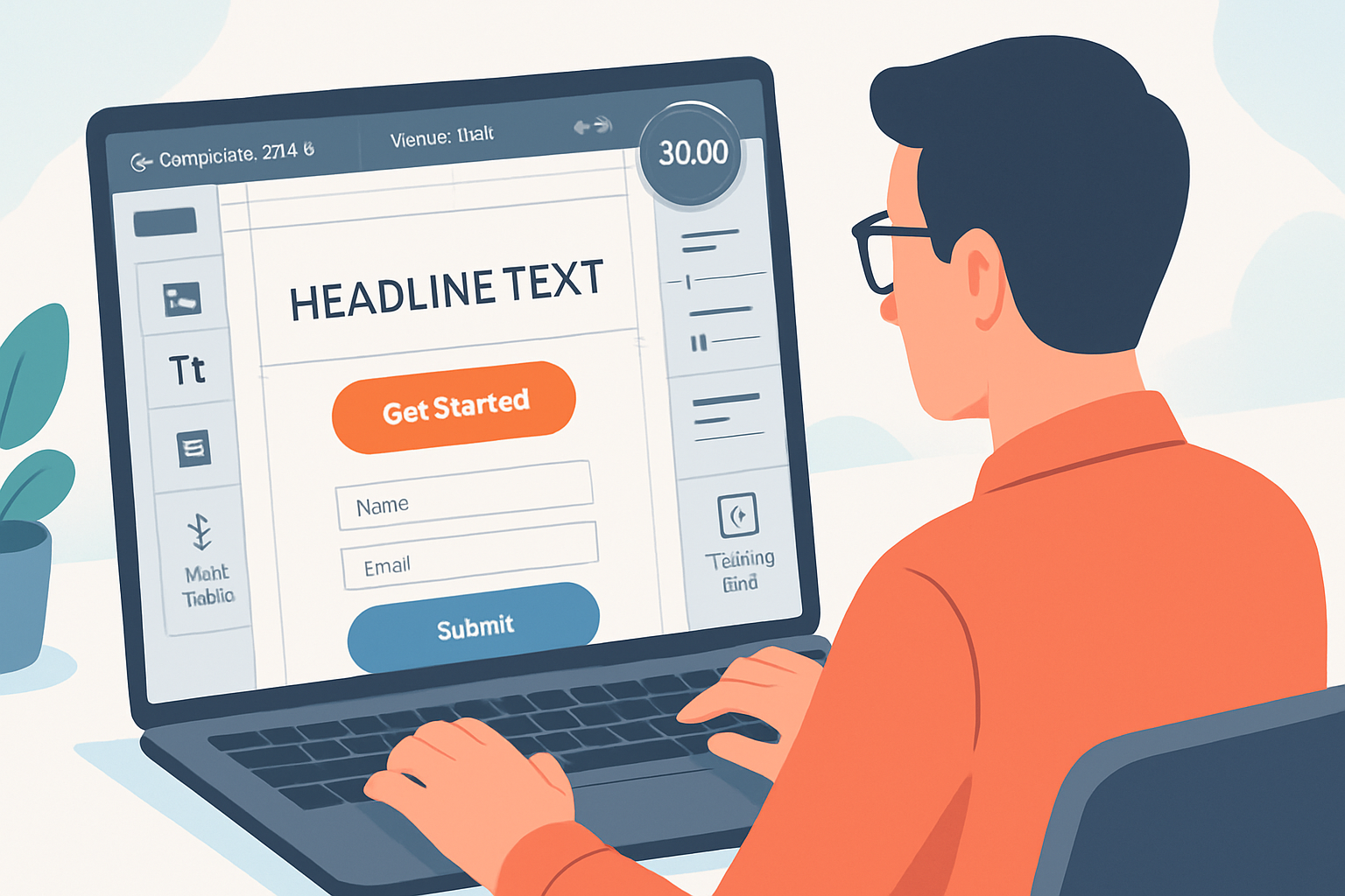
Step 2 - Write a headline that stops scroll (5–12 minutes)
Your headline carries ~70% of the landing page’s weight. Make it clear first, clever second.
- Formula examples:
- Problem → Outcome - “Sick of messy lead lists? Get qualified leads in 7 days.”
- How → Result - “How to double demo bookings with one email sequence.”
- Subheadline - one sentence that expands the headline with a specific benefit or metric.
- Hero image - choose a single, relevant visual (product screenshot or contextual photo). Avoid generic stock clutter.
CTA copy (make it action + benefit):
- Bad - “Submit”
- Good - “Get my free audit” | “Book 15‑min demo” | “See pricing”
Design rules for the hero:
- High contrast CTA (use a color that stands out against the background).
- Keep the most important elements above the fold.
- Use whitespace; let the headline breathe.
Reference: landing page copy best practices: https://cxl.com/blog/landing-page-copy/ and https://blog.hubspot.com/marketing/landing-page-best-practices-list
Step 3 - The form & conversion flow (12–18 minutes)
Make the form the lowest-friction path to conversion.
- Keep fields to a minimum. Rule of thumb - 1–3 fields for a first conversion.
- If you need more info, use progressive profiling (ask more later) or split into two steps.
- Place labels above fields and use helpful microcopy for anything that needs explanation (e.g., “We’ll never spam you”).
- Consider an alternative CTA - if you sell a product, try a click-to-cart/checkout button instead.
Form confirmation: choose a clean confirmation screen or redirect to a thank-you page so you can track conversions and show next steps.
Integration: connect the form to your email tool, CRM, or webhook. Unbounce supports native integrations and Zapier.
Step 4 - Add trust & reduce friction (12–18 minutes, overlap)
Trust signals increase conversion by reducing perceived risk.
- Use 2–3 short testimonials (photo + name + short quote) or logos of recognizable customers.
- Add a clear privacy line next to the form (e.g., “No spam. Unsubscribe anytime.”).
- Use an authoritative microcopy about what happens after they convert (e.g., “You’ll receive an email with next steps”).
Design note: place trust signals near the CTA or form. People decide quickly; proximity matters.
Step 5 - Mobile optimization & UX polish (18–22 minutes)
Mobile-first thinking matters. Unbounce has responsive controls, but check manually.
- Switch to mobile view and - reduce headline size, stack columns, increase button size and tap targets.
- Hide non-essential images/sections on mobile.
- Ensure the form fields don’t get clipped by the keyboard.
Micro-UX: remove navigation links (they create escape routes). If you must keep links, open them in new tabs.
Step 6 - Tracking, automation & launch (22–26 minutes)
Before publishing, add tracking so you can learn fast.
- Use Unbounce Script Manager for Google Analytics, Facebook/Meta Pixel, LinkedIn Tag, Hotjar, etc. (paste pixels in Script Manager).
- Reference - Script Manager docs:
- Enable Smart Traffic to automatically route traffic to the best variant once you have more than one. Smart Traffic can lift conversion rates without manual winner-hunting: https://unbounce.com/features/smart-traffic/
- Set the confirmation action - in-page confirmation message or redirect to a dedicated thank-you page (helpful for event conversion tracking).
Quick integration checklist:
- Email tool/CRM connected
- Pixel(s) added and firing (use preview mode or tag assistant)
- Smart Traffic enabled (optional but recommended)
Step 7 - Publish, test, and iterate (26–30 minutes)
- Publish to your Unbounce subdomain for fastest results or set up a CNAME for your domain (Unbounce hosting instructions in the dashboard).
- Smoke test - submit the form, confirm you receive the email/CRM entry, and check the confirmation page.
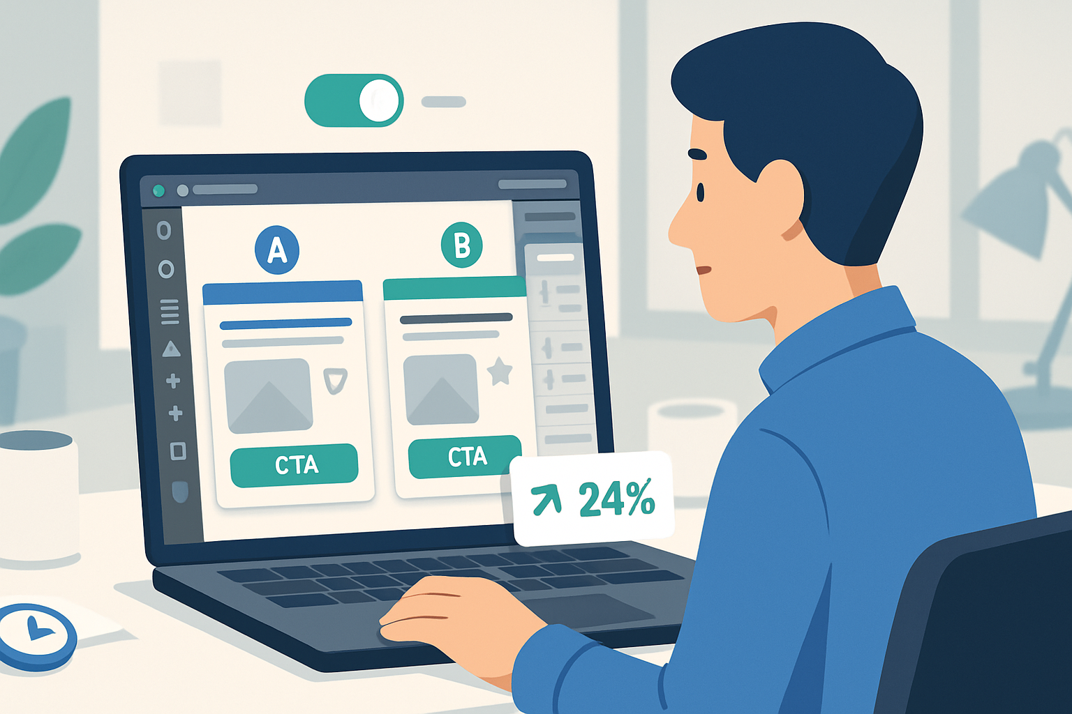
- Create one A/B variant (change headline or CTA color) and activate Smart Traffic or an A/B test to start collecting comparative data.
Testing mindset: run short, directional tests. The goal is to get reliable signals quickly, not statistical perfection on day one.
Copy & design cheat sheet (use these immediately)
Headline formulas:
- “[Desire] without [pain/problem].” - e.g., “Get more leads without painful outreach.”
- “How to [desirable result] in [timeframe].” - e.g., “How to book 3 demos in one week.”
CTA microcopy examples:
- “Get my free audit”
- “Start my free trial”
- “Book a demo - it’s free”
Design quick rules:
- Single primary CTA. Keep other CTAs secondary and visually muted.
- Use 1–2 fonts max. Use size contrast to create a visual hierarchy.
- Buttons should be big, have sufficient padding, and be mobile friendly.
Form field rules:
- Ask only what you need. Email + first name is often enough.
- Use optional fields sparingly.
Quick Unbounce features to leverage (and where they help)
- Smart Builder - fast layouts and AI-assisted suggestions for structure and copy:
- Smart Traffic - automatically directs visitors to the best-performing variant:
- Dynamic Text Replacement (DTR) - match headlines to ad keywords to improve relevance. Learn more:
- Popups & Sticky Bars - use sparingly for exit intent offers or capturing abandoning visitors:
Use these features to remove guesswork and automate winning decisions.
Common mistakes to avoid
- Trying to say everything at once. Focus on one promise.
- Overloading the form with fields.
- Long paragraphs in the hero. Keep it scannable.
- Skipping mobile checks.
- Publishing without analytics/pixel - if you can’t measure it, you can’t improve it.
Final checklist before you stop the timer
- Template chosen and goal set
- Headline, subheadline, and CTA written
- Form added and integrated to email/CRM
- Trust signals in place
- Mobile view checked
- Tracking pixels added (Script Manager)
- Page published and smoke-tested
- A/B variant created or Smart Traffic enabled
Building a high-converting page in half an hour is about ruthless prioritization: eliminate options, emphasize clarity, and instrument every click. Ship a focused page, gather data, and iterate - that loop is your conversion engine. Ship fast. Measure faster. Improve relentlessly.