· productivity · 6 min read
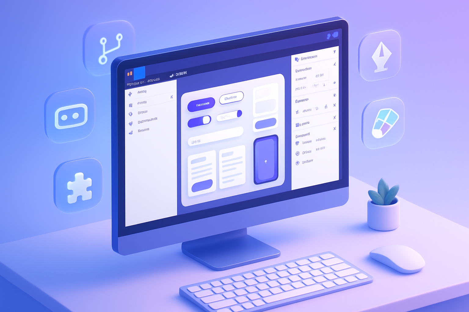
Figma for Developers: Bridging the Gap Between Design and Code
Practical, code-focused guidance for developers who want to turn Figma files into production-quality UI faster and with fewer misunderstandings. Learn workflows, tools, plugins, code snippets and handoff checklists you can use today.

Outcome first: use Figma to cut days off handoffs, reduce bugs caused by miscommunication, and ship UI that matches the design intent-without becoming a designer.
This post shows how to work with Figma as a developer: where to look, what to ask for, which tools to use, and small coding patterns that turn design artifacts into reliable production code.
Why this matters
Design and engineering speak different dialects of the same product language. Figma is a translator. But only when both sides use it with predictable patterns. Do that, and you’ll get: faster handoffs, fewer layout regressions, better reuse of components, and a single source of truth for visual tokens.
Quick wins (apply in your next sprint)
- Ask for a Dev Mode link and components with clear names. Short step. Big impact.
- Require design tokens exported as JSON (colors, spacing, typography). Then wire them into CSS variables or your theme system.
- Insist on using variants and auto-layout for responsive behavior. They map well to props and constraints in code.
Core concepts developers should master
- Components & Variants - Treat a Figma component as the “single source of truth” for a UI element. Variants map naturally to component props in React/Vue/Svelte.
- Auto Layout - Think of it like a layout engine for components. If an element uses auto layout, its spacing and resizing are intentional and predictable in production.
- Styles / Design Tokens - Colors, text styles, effects, and grids used consistently across files are design tokens. Export them and use them as your theme variables.
- Dev Mode & Inspect - Use Dev Mode for accurate CSS, spacing, and asset export values. It’s the developer view that replaces manual measurements.
Reference links
- Figma Dev Mode and Inspect: https://help.figma.com/hc/en-us/articles/360039823254-Use-Dev-mode-to-get-design-details-for-devs
- Auto Layout guide: https://help.figma.com/hc/en-us/articles/360040451373-Auto-layout-in-Figma
- Figma API and docs: https://www.figma.com/developers
Practical workflow: Design -> Dev handoff (step-by-step)
Pre-handoff checklist (ask the designer to complete)
- Components - All reusable elements converted to components and organized in an accessible library.
- Variants - Button states, size variants, icon+label vs icon-only – grouped as variants.
- Tokens exported - Colors, typography, spacing, radii, shadows exported as a tokens JSON (via plugin or style export).
- Auto layout - Buttons, lists, cards use auto layout for predictable resizing.
- Layout grids - Page/frame grids for responsive breakpoints.
- Accessibility notes - Color contrast checks and focus states documented.
- Annotated interactions - Short notes describing hover/press/focus and transitions.
Developer intake
- Open the file in Dev Mode. Copy token values and style names used by components you will implement.
- Inspect components for padding, gap, and constraints (left/right/center). These tell you whether the component should flex or remain fixed.
- Export assets with the correct format (SVG for icons/illustrations when possible; 1x/2x PNG for raster).
Implementation mapping
- Map Figma components to code components - Button. Button[variant=“primary”]. Button[icon=true].
- Map variants to props. One variant per prop where it makes sense (size, tone, state).
- Use tokens as theme values instead of hardcoded values.
Example: tokens -> CSS variables
Design tokens exported as JSON (example):
{
  "color": {
    "primary": "#1E90FF",
    "accent": "#FF6B6B",
    "bg": "#FFFFFF"
  },
  "spacing": {
    "sm": "8",
    "md": "16",
    "lg": "24"
  },
  "radius": {
    "base": "6"
  }
}
Small Node script to convert to CSS custom properties:
const tokens = require('./tokens.json');
const lines = [];
function walk(obj, path = []) {
  for (const key of Object.keys(obj)) {
    const val = obj[key];
    const newPath = [...path, key];
    if (typeof val === 'object') walk(val, newPath);
    else
      lines.push(
        `--${newPath.join('-')}: ${val}${/\d+$/.test(val) ? 'px' : ''};`
      );
  }
}
walk(tokens);
console.log(':root {');
console.log('  ' + lines.join('\n  '));
console.log('}');
Run and paste the result into your base CSS or generate it at build time. Now designers’ colors and spacing flow directly into your UI.
Using Figma API to automate checks
The Figma API is useful for programmatic exports and validation. Example use cases:
- Pull style definitions to verify token parity.
- Generate a style diff between design versions.
- Programmatically export SVGs for icons.
Basic curl to fetch a file (replace FILE_KEY and TOKEN):
curl -H "X-Figma-Token: TOKEN" "https://api.figma.com/v1/files/FILE_KEY"Then parse the JSON to find styles: you can also use GET /v1/files/:file_key/styles to list named styles. See the Figma API docs for details: https://www.figma.com/developers
Plugins and tools that make your life easier
- Figma Tokens plugin - export and manage tokens as JSON. https://www.figma.com/community/plugin/843461159747178978/Figma-Tokens
- Dev Mode (built-in) - the primary developer surface for measurements and assets. https://help.figma.com/hc/en-us/articles/360039823254-Use-Dev-mode-to-get-design-details-for-devs
- Auto Layout & Variants (build predictable components): https://help.figma.com/hc/en-us/articles/360040451373-Auto-layout-in-Figma
- Style Dictionary - transforms tokens into platform formats (CSS, iOS, Android). https://amzn.github.io/style-dictionary/
Tips that save time (and sanity)
- Naming conventions - agree on a naming convention for component and style names. Examples: Button/Primary, Icon/Close, Text/Body/MD. Predictable names speed up lookups.
- Prefer SVG for icons and inline them where you need styling control (fill, stroke) in code.
- Use layout grids and document breakpoint behavior explicitly in the file.
- Request “edge cases” up front - very long labels, empty states, error states-these often break layouts.
- Keep exports versioned. If the design changes mid-sprint, request a new file version or branch so you can compare what changed.
Mapping Figma constructs to code
- Component = Code component
- Variant = Prop(s) or enum
- Auto Layout = Flexbox / Stack layout behaviour
- Constraints = responsive anchors (left/right/stretch) -> CSS constraints/percent widths/flex rules
- Styles = Tokens (theme values)
Common pitfalls and how to avoid them
- Over-reliance on code-export features - auto-generated code from Figma can speed prototyping. But it’s rarely production-ready. Use generated code as a reference, not final code.
- Unsupported features difference - shadows, blend modes, and boolean operations may render differently across platforms. Test and, if necessary, replace with platform-appropriate implementations.
- One-off components in the file - they create technical debt. Encourage consolidation into component libraries.
Accessibility and semantics
Designs should include accessibility intent. Ask designers to:
- Provide semantic labels for interactive elements.
- Document keyboard behavior where relevant.
- Check color contrast ratios and provide alternatives or states for focus.
Sample handoff checklist (copyable)
- Dev Mode link provided
- Component library with names and variants
- Tokens exported as JSON
- Images and icons exported as SVG/PNG with scales
- Layout grids and breakpoint notes included
- Accessibility and interaction notes present
Why this collaboration works (and scales)
When designers adopt atomic structure (components + tokens + variants) and developers consume those artifacts predictably (theme system + components + token-driven styles), the work scales. Fewer mismatches. Fewer bugs. Faster iterations.
Final practical rules you can adopt tomorrow
- Always start in Dev Mode for measurements and assets.
- Insist on tokens. Wire them into your theme at build time.
- Map variants to props, not separate components.
- Use auto layout behaviors to guide responsive implementations.
- Treat generated code as documentation, not production code.
Further reading
- Figma Dev Mode: https://help.figma.com/hc/en-us/articles/360039823254-Use-Dev-mode-to-get-design-details-for-devs
- Figma API: https://www.figma.com/developers
- Style Dictionary (tokens tooling): https://amzn.github.io/style-dictionary/
- Figma Tokens plugin: https://www.figma.com/community/plugin/843461159747178978/Figma-Tokens
Takeaway
Use Figma not as a static handoff board, but as a collaborative, machine-readable source of truth. Push for tokens, components, variants and Dev Mode. Convert those artifacts to theme values and props in your codebase. Do that and you’ll ship designs that look and behave like the intent-faster and with fewer regressions.