· productivity · 6 min read
Customizing Templates in No-Code Website Builders: Tips and Tricks
A practical, in-depth guide to transforming pre-built no-code templates into distinct, high-performing websites. Learn a step-by-step workflow, design principles, SEO & accessibility tips, responsive tricks, CMS and ecommerce customization strategies, plus common pitfalls and quick fixes.
Why customize a template?
Pre-built templates are the fastest way to launch a site, but a straight-out-of-the-box template can look generic, misaligned with your brand, or perform poorly for your goals. Customizing templates lets you keep the speed and structure of a starter design while creating something that feels uniquely yours - optimized for conversions, speed, accessibility, and brand story.
This guide walks through a practical workflow, design principles, technical optimizations, and real-world tips for customizing templates in any no-code website builder (Webflow, Wix, Squarespace, Bubble, Shopify, etc.).
Quick checklist (read first, implement later)
- Define goal and core pages before editing (homepage, product/offer page, about, contact)
- Collect brand assets - logo, color hexes, fonts, photography, messaging
- Map template sections to your content (what to keep, remove, replace)
- Implement responsive checks at small, medium, large breakpoints
- Optimize images and media for web (resize, compress, proper formats)
- Add meaningful SEO metadata and accessible alt text
- Test performance and accessibility; iterate
1. Start with intent: goals, audience, and content hierarchy
Before you touch fonts or colors, clarify:
- Primary goal - collect emails, sell products, book calls, showcase work
- Target audience - demographics, expectations, device usage
- Most important content above the fold (value proposition + CTA)
Having those answers keeps customizations purposeful instead of decorative.
2. Map the template structure to your content
Open the template and do a quick audit:
- Identify reusable sections (hero, features, testimonials, footer)
- Note sections that are irrelevant or missing
- Create a simple sitemap that mirrors your goals
This prevents scope creep - don’t try to redesign every component at once.
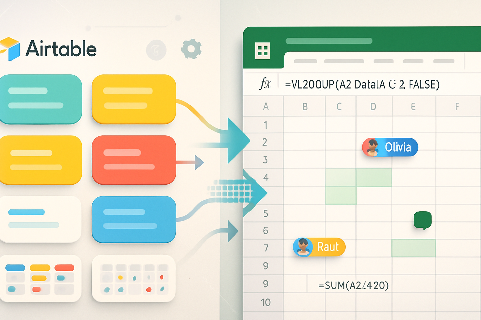
3. Use the builder’s design system: components, styles, classes
Most no-code builders provide a style system (global colors, typography, reusable components or symbols). Use it.
Why:
- Maintain consistency site-wide
- Speed up future revisions
- Make global changes (like brand color update) instantly
Practical tips:
- Create master classes for headings, body text, buttons
- Use named color swatches (Primary, Accent, Muted) instead of ad-hoc hexes
- Convert repeating sections into symbols/components
Reference: Webflow University has great resources on using classes and components: https://university.webflow.com/
4. Visual design principles - make the template yours
Small visual decisions have big impact. Focus on:
- Typography - choose 1–2 font families (one for headings, one for body). Keep contrast and size scale consistent. Use Google Fonts or your brand fonts. Example resource:
- Color - pick a restrained palette - primary (action), secondary (support), neutral (text/background), accent (sparingly). Tools:
- Spacing - use a clear spacing scale (e.g., 8px base) for margins and paddings to create rhythm
- Visual hierarchy - make the primary CTA the most visually prominent element on the page
Tip: Test typography and spacing on actual content (your headings and paragraphs), not placeholder text.
5. Content-first copy and imagery
Design follows content. Replace placeholder text and stock photos immediately.
Copy tips:
- Headlines - state the benefit, not the feature
- Subheads - clarify or support the headline
- CTAs - use action-oriented microcopy (“Start free trial” > “Submit”)
Imagery tips:
- Use authentic photos where possible (real team, real product)
- Keep aspect ratios consistent across hero/gallery images for a tidy layout
- Compress images and use modern formats (WebP when possible) - tools like TinyPNG help: https://tinypng.com/
6. Responsive behavior: don’t assume defaults are enough
Templates often look great on desktop but break on tablets or phones. Check and adjust at common breakpoints.
Key checks:
- Navigation - mobile menu behavior, tap targets, and sticky headers
- Text sizing - ensure headings and paragraphs reflow properly without overflow
- Images and videos - use responsive attributes (set max-width: 100%) and serve appropriately sized files
Learn responsive design basics: https://developer.mozilla.org/en-US/docs/Learn/CSS/CSS_layout/Responsive_Design
7. Accessibility - small changes, big impact
Make your customized site usable for more people.
Checklist:
- Add descriptive alt text for images
- Ensure sufficient color contrast (text vs background)
- Make interactive elements keyboard accessible and visible focus states
- Use semantic structure (H1 → H2 → H3, proper form labels)
Reference the WCAG guidelines and accessibility tools: https://www.w3.org/WAI/standards-guidelines/wcag/ and test with the WAVE tool: https://wave.webaim.org/
8. SEO and metadata - don’t forget the basics
Templates may include generic meta tags. Customize them:
- Unique title tags and meta descriptions per page
- Use schema where relevant - Product, Article, LocalBusiness
- Clean URL structures and descriptive slugs
- Optimize headings and include target keywords naturally
Google’s SEO starter guide is a useful reference: https://developers.google.com/search/docs/fundamentals/seo-starter-guide
9. Performance optimization
Fast sites convert better. After customizing:
- Compress and lazy-load images; convert to WebP when possible (TinyPNG can convert and compress)
- Minimize custom code and third-party scripts
- Use the builder’s built-in hosting/CDN where possible
- Audit performance with PageSpeed/Lighthouse and fix the top issues: https://developers.google.com/speed/pagespeed/insights/
10. CMS and dynamic content
If you’re using a no-code CMS (like Webflow CMS, Bubble collections, or Shopify products), adapt templates to your content model:
- Create collections/collections fields that match real content (title, slug, images, rich text, SEO fields)
- Design item templates (blog post, product page) to accommodate variable content lengths
- Use conditional visibility (show sections only if CMS fields exist)
See CMS intro: https://university.webflow.com/lesson/cms-intro
11. Integrations and third-party widgets
Add only necessary integrations (analytics, forms, chat, payment gateways). Too many widgets slow the site and clutter the UI.
Tips:
- Use server-side integrations when possible (webhooks) to reduce client script load
- Prefer native platform integrations for checkout, email, or CRM to avoid extra scripts
12. Workflows: staging, backups, and collaboration
- Use a staging environment or duplicate the site before major changes
- Keep manual backups or use the builder’s version history
- Collaborate with comments and share preview links with stakeholders
Many builders offer automatic site backups - learn your platform’s workflow (e.g., Webflow backups and versioning).
13. Test, iterate, measure
- Test on real devices and browsers
- Use heatmaps and analytics to see how users interact with the customized template
- A/B test CTAs, hero layouts, or images to improve conversions
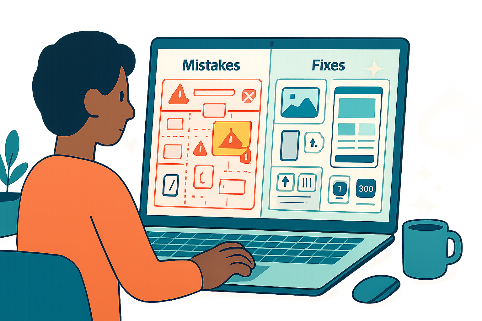
14. Common mistakes and quick fixes
- Mistake - Replacing fonts with too many styles → Fix: limit fonts and use a scale
- Mistake - Overloading hero with text and images → Fix: simplify; focus on a single CTA
- Mistake - Ignoring alt text and accessibility → Fix: add descriptive alt text and run accessibility audits
- Mistake - Uploading huge images → Fix: resize + compress and use lazy loading
15. Practical examples (mini case studies)
- Local consultant landing page
- Keep template hero but swap to a single strong benefit headline, add a 1–2 sentence subhead, and CTA. Replace stock imagery with a professional headshot. Create an optional consulting services section with 3 cards and contact form.
- Creative portfolio
- Use a grid gallery component, convert featured projects to CMS items, and add case study pages. Use large images with consistent aspect ratios, minimal text overlays, and an easy-to-find contact CTA.
- Small ecommerce shop
- Customize product template to highlight USPs, add trust signals (reviews, shipping info), and simplify checkout. Ensure product images are consistent, add alt text and structured data for rich results.
Tools & resources
- Webflow University - guides on classes, components, CMS: https://university.webflow.com/
- Google PageSpeed Insights and Lighthouse: https://developers.google.com/speed/pagespeed/insights/
- SEO starter guide: https://developers.google.com/search/docs/fundamentals/seo-starter-guide
- WCAG accessibility standard: https://www.w3.org/WAI/standards-guidelines/wcag/
- TinyPNG for image compression: https://tinypng.com/
- Responsive design primer: https://developer.mozilla.org/en-US/docs/Learn/CSS/CSS_layout/Responsive_Design
Final checklist before publishing
- Brand colors and fonts applied globally
- Hero communicates primary value and CTA
- Images optimized and alt text added
- Mobile/Tablet layout checked and adjusted
- Metadata and schema implemented
- Accessibility and performance audits run
- Backup or staging snapshot taken
Customizing a template isn’t just cosmetic - it’s about making design, content, and technical choices that align with your goals. Start small, rely on the builder’s design system, prioritize content and accessibility, and measure what matters. With the right workflow, you can turn any template into a fast, accessible, high-converting website that truly reflects your brand.