· productivity · 6 min read
Creative Web Apps for Students: Enhance Your Project Presentations
Discover web apps that help students build engaging presentations, infographics, and interactive visuals. Practical tool picks, workflow tips, and a step-by-step mini-project to make your next assignment stand out.
Why creative web apps matter for student projects
In a crowded classroom or virtual gallery of slides, strong visuals and thoughtful interaction make your work memorable. Creative web apps give students access to design-quality templates, data visualization, multimedia embedding, and collaboration features - without needing advanced design skills. This guide helps you pick the right tools, improve your visual storytelling, and walk through a simple interactive infographic workflow.
How to choose the right app for your project
Start by matching the app to your goals. Ask:
- What format do I need? (slides, poster, infographic, interactive page)
- Do I need data visualization or animation?
- Will I collaborate in real time?
- Are there cost or account restrictions from my school?
Quick rules of thumb:
- Use slide-focused apps for linear presentations (e.g., class talks).
- Use infographic and visual-story apps for posters and one-page overviews.
- Use interactive/story tools when you want viewers to explore data or narrative nonlinearly.
Top web apps students should know (what they do best)
Canva - general-purpose design and presentation tool with beginner-friendly templates, drag-and-drop editing, and lots of free assets. Great for posters, slide decks, and social-media graphics. Canva
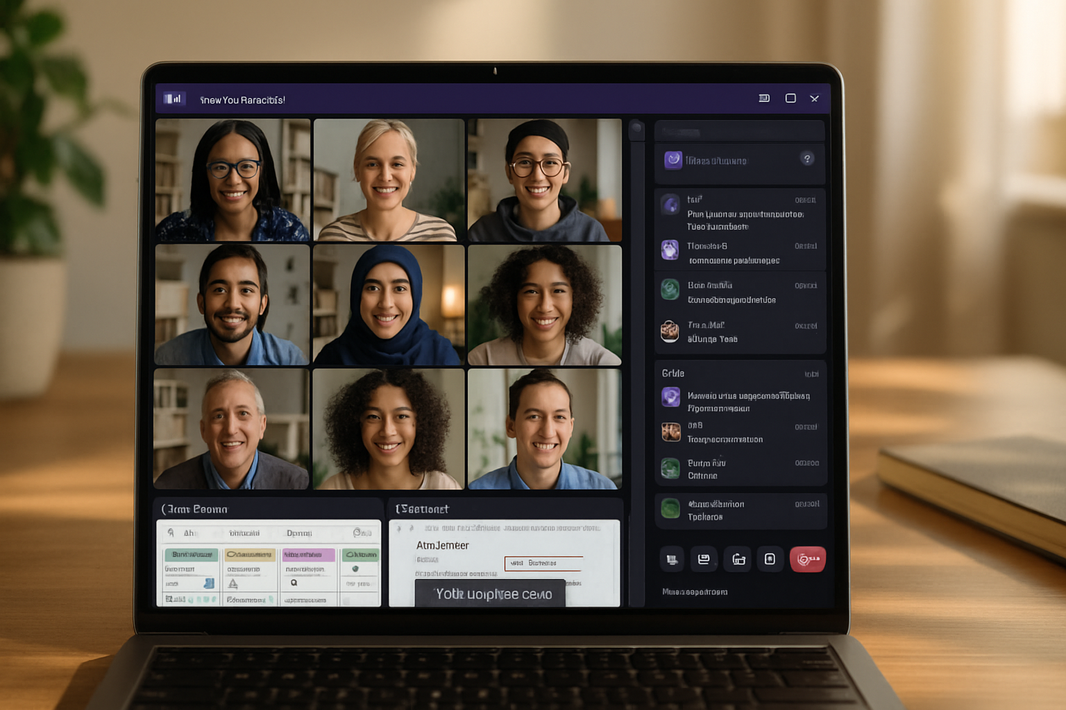
Google Slides - simple, collaborative slide editor that works well for teams and integrates with Google Drive. Best when you need live collaboration and easy sharing. Google Slides
Prezi - zoomable, non-linear presentations that emphasize spatial storytelling. Use when you want an energetic, cinematic flow. Prezi
Genially - builds interactive presentations, infographics, and micro-sites with embedded interactivity and animation. Excellent for interactive classroom projects. Genially
Visme - combines presentations, infographics, and data widgets (charts, maps) aimed at polished visual reports. Visme
Piktochart - focused on infographics and reports, with strong templates for data-rich visuals. Piktochart
Beautiful.ai - AI-assisted slide designer that helps enforce good layouts automatically. Useful when you want quick, consistent slide design. Beautiful.ai
Figma - collaborative design tool for custom layouts, UI prototypes, and advanced visuals. Steeper learning curve but powerful for bespoke work. Figma
Adobe Express - simplified Adobe tool for quick graphics, social posts, and slides with access to Adobe stock assets. Adobe Express
Datawrapper - fast, accessible charts and maps for accurate data visualization. Often used in journalism and student research. Datawrapper
Flourish - interactive charts, stories, and maps for embedding live visuals into presentations or web pages. Flourish
Timeline JS - create interactive timelines from spreadsheets (great for history or project milestones). Timeline JS
Observable - interactive, code-based notebooks for data visualization (JavaScript). Great for advanced students who want custom, data-driven visuals. Observable
Practical workflows and tips to make visuals that work
Plan the story first
- Outline your message or narrative in 3–5 points before you open an editor. Visuals should support the story, not distract from it.
Start with a template, then customize
- Templates speed up layout and hierarchy decisions. Tweak colors, fonts, and images to match your topic and school brand.
Keep hierarchy and white space
- Use headings, subheadings, and generous spacing. Avoid cramming text - aim for one idea per visual unit.
Use color and contrast deliberately
- Limit palettes to 2–4 colors. Use contrast to highlight key facts. Tools like Coolors can help generate palettes.
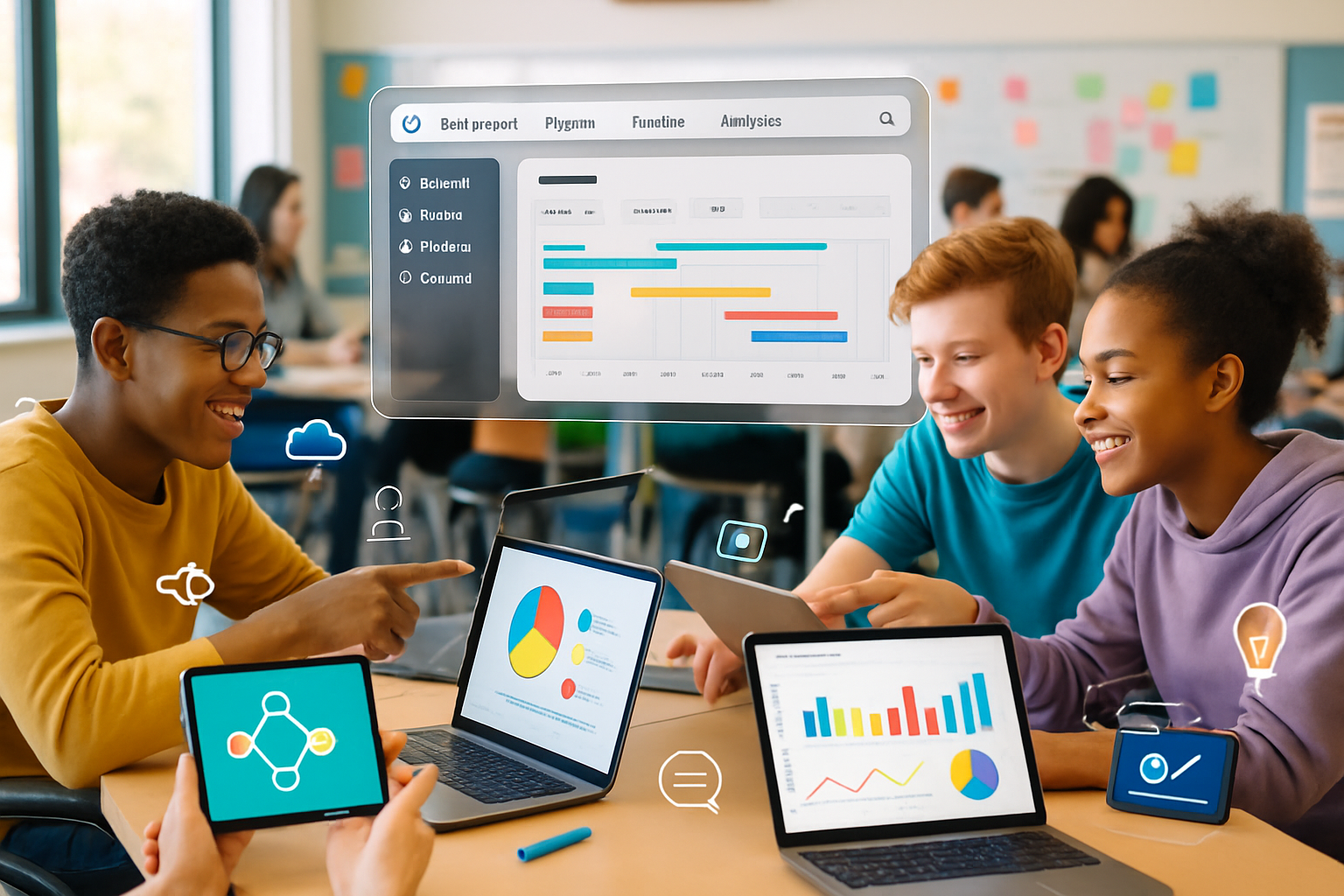
Make data readable
- Choose the right chart for the data (bar for comparisons, line for trends). Label axes and avoid clutter. Use tools like Datawrapper or Flourish for accessible visuals.
Add interactivity when it supports learning
- Interactive elements (hover details, filters, embedded audio/video) let viewers explore without overwhelming them. Use Genially, Flourish, or embedded Google Sheets charts.
Optimize for sharing and accessibility
- Export high-resolution images/PDFs for print, or share links for interactive web versions. Add alt text to images and use readable font sizes for accessibility.
Collaboration, file management, and versioning
- Use cloud-native apps (Google Slides, Figma, Canva for Education) so teammates can edit simultaneously.
- Keep a single source of truth for assets (a shared Google Drive or Figma project). Name files clearly and use version history when available.
- For group presentations, divide work by slide or section and do a final design pass together to ensure consistency.
Free and low-cost options for students
Many apps offer free tiers suitable for students:
- Canva and Google Slides have rich free features.
- Figma offers free starter plans for teams.
- Datawrapper and Flourish have free or educational licenses for basic charts.
- Sites like Unsplash, Pexels, and The Noun Project provide free images and icons (check license requirements).
Check if your school offers a free or discounted education account - many providers have special plans for classrooms.
A short step-by-step: Create an interactive infographic in Genially
- Sign up for a free Genially account at Genially.
- Choose the “Infographic” template that matches your structure (timeline, comparison, report).
- Replace placeholder text with your concise points (use short sentences and bullet facts).
- Add data visuals - import charts or embed a Flourish/Datawrapper chart for interactive data.
- Insert interactive hotspots - attach pop-ups or links to expand explanations without cluttering the design.
- Embed multimedia - add short audio clips, videos, or annotated images to support evidence.
- Preview and test interactions on different screen sizes.
- Publish and copy the share link or export a PDF/image for print.
This workflow keeps your infographic compact while giving viewers the option to explore deeper details.
Classroom project ideas using creative web apps
- Scientific poster with embedded charts and short video demo (Canva + Datawrapper + YouTube).
- Interactive book report - a timeline of events and character maps (Timeline JS + Genially).
- Civic-data project - map demographic data with Flourish and present policy recommendations.
- Design critique - recreate an app interface in Figma and present usability improvements.
Accessibility and ethical use of visuals
- Always cite data sources on your visuals.
- Avoid misleading scales or truncated axes.
- Provide transcripts or alt text for multimedia.
- Respect copyright - use licensed images or public-domain assets.
Helpful resources: Unsplash, Pexels, The Noun Project, Google Fonts.
Final checklist before you submit or present
- Does each slide or panel communicate one clear idea?
- Is your data source cited and your chart choice appropriate?
- Have you tested links and interactive elements?
- Is the text legible from a distance (if presenting in class)?
- Have you run an accessibility check (color contrast, alt text)?
Conclusion
Creative web apps put professional-looking design and interactivity within reach for students. By choosing the right tool for your goal, planning your story, and following design and accessibility best practices, you can turn routine assignments into compelling, shareable projects that stand out.
Try a small experiment: pick one new app from the list above and rebuild a slide or one-page report - you’ll quickly learn which features help your workflow and which you can skip.