· productivity · 5 min read
The Art of the Board: How to Design a Trello Board That Everyone Loves
Practical design principles and Trello-specific best practices to build aesthetically pleasing, highly functional boards that increase team engagement and efficiency.
Outcome first: by the end of this article you’ll be able to design a Trello board that reduces confusion, speeds work, and that people actually enjoy using - consistent, beautiful, and built to fit your team’s workflow.
Why this matters
A well-designed board is not a decoration. It’s an attention management system. It helps people see what matters, what’s next, and how to act. When boards confuse, work stalls. When boards communicate, teams move faster and feel less friction.
Start with clarity
- Define the board’s purpose in one sentence. (E.g., “This board manages our two-week engineering sprint.”)
- Identify your audience. Who uses it daily? Who inspects it occasionally?
- Map the workflow before you build - capture, triage, doing, review, done.
Plan before you create
Sketch a simple flow on paper or a whiteboard. Don’t start by adding colors and stickers. Start with behavior.
- What are the states a task goes through? (Backlog → Ready → In Progress → Review → Done)
- Where does responsibility change hands? Mark those transition points.
- Which items require strict limits (WIP limits) or SLAs?
Core design principles for beloved boards
- Clarity over cleverness
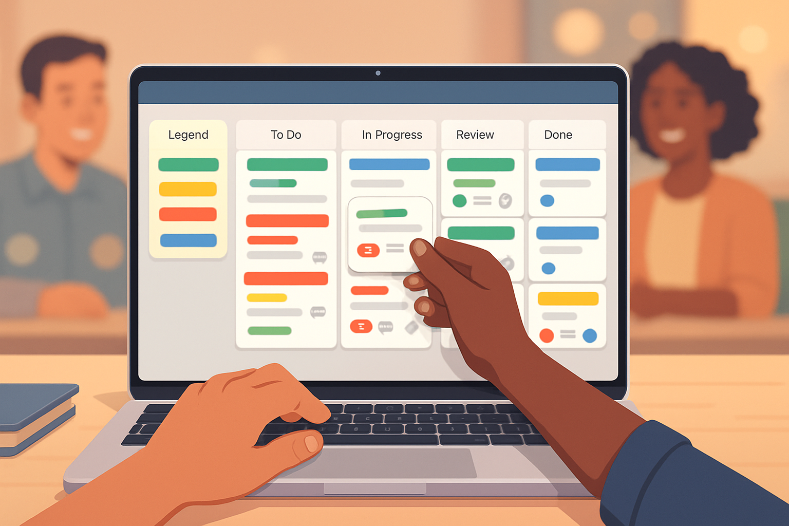
Be explicit. Use clear column titles. Prefer “In Review” to “Polishing.” Use a legend card (pinned to the left) that explains labels, card colors, and conventions.
- Consistency
Apply the same label colors and naming conventions across boards. Predictability reduces cognitive load. If red means blocker on one board, it should mean blocker everywhere.
- Visual hierarchy
Use cover images or label colors to create a readable hierarchy: high-priority cards stand out; standard tasks recede into the background.
- Minimalism and focus
Fewer lists and fewer simultaneous priorities keep attention focused. Resist building a list for every micro-state.
- Affordance and feedback
Make it easy to act: clear next actions on cards, checklists for steps, due dates visible, and automatic reminders where helpful.
Trello-specific design choices (how to use the tool well)
Board layout
- Left-to-right is natural. Put Backlog and Inbox on the left; Done on the far right.
- Add an anchored “Info” list as the first column to store board purpose, conventions, and a template card.
Card anatomy
A great card answers three quick questions: What is it? Who owns it? What is the next action?
- Title - short, action-oriented (“Write landing page copy” not “Landing page”).
- Description - essential context, links, acceptance criteria.
- Checklist(s) - break it down into verifiable steps.
- Members - assign one owner when work is active.
- Due dates and reminders - when timing matters, use them.
- Attachments - a single canonical place for relevant docs.
Labels and color systems
Labels are visual shorthand. Use them sparingly and with a legend.
Example label scheme:
- Red - Blocker / High priority
- Orange - Needs review
- Green - Ready for work
- Blue - Feature
- Yellow - Bug
Put the legend in the Info list and in your board template.
Covers, emojis, and stickers
Use covers or emoji icons on cards only to signal things that matter (e.g., priority, type, or public-facing items). Too many visuals create noise. One strong visual cue is better than many subtle ones.
Power-Ups and automation (work smarter, not harder)
- Templates - Use board and card templates for repeatable processes. See Trello templates:
- Butler automation - Automate repetitive moves, set rules for status changes, and schedule cleanups. Getting started guide:
- Calendar and Calendar Power-Up - Make deadlines visible in context.
Keep automation readable. Document what rules exist in the Info list so teammates understand automatic behavior.
Accessibility and inclusive design
- Use color + text. Don’t rely on color alone to convey meaning.
- Write clear, scannable card titles for screen readers.
- Maintain reasonable contrast between text and backgrounds.
Governance and board hygiene
A tidy board stays loved.
- Weekly triage - archive old cards, close stale tasks, and reassign or decompose oversized cards.
- Ownership - decide who can edit labels, lists, and automation rules.
- Versioning - when you change conventions, update the Info card and notify the team.
Onboarding: make adoption painless
- Create a short board template with an onboarding card that teaches conventions in three steps.
- Run a 10-minute demo with new members. Show them how to find the legend and how to create a well-formed card.
Proven board layouts (copy-and-use)
- Simple Kanban (best for flow teams)
Lists: Backlog | Ready | In Progress | Review | Blocked | Done
Labels: Priority / Type / Sprint
- Sprint board (engineering)
Lists: Product Backlog | Sprint Backlog | Doing (with WIP per developer) | QA | Merge | Done
Use custom fields for story points and epic links.
- Content calendar (marketing)
Lists: Ideas | Pitching | Writing | Review | Scheduled | Published
Cards: include due date for publish and an editorial checklist.
Measuring engagement and effectiveness
Track simple signals to know whether the board helps or hurts:
- Card flow - Are cards moving to Done faster?
- Cycle time - Time from Ready → Done.
- Participation - Number of comments and card updates per sprint.
- Triage frequency - How often are items cleaned or re-prioritized?
If metrics stagnate, ask: is the board the problem, or is the process?
Design examples and small, practical rules
- Rule of three. Limit visible priorities to three per person.
- One owner per active card. Shared responsibility breeds paralysis.
- Make “Done” delightful - archive regularly. Celebrate movement.
References and further reading
- Trello Guide and general help: https://trello.com/guide
- Trello templates: https://trello.com/templates
- Butler automation guide: https://help.trello.com/article/1190-getting-started-with-butler
- Nielsen Norman Group on usability principles: https://www.nngroup.com/articles/10-usability-heuristics/
Final word
Designing a board is designing for people’s attention and time. Beauty matters only when it helps someone act. Build clarity first. Automate what you can. Keep it consistent. When the board reduces friction, it becomes invisible - and that is when people start to love it.